

You’re probably dealing with one of two problems right now. Either the office looks dated and heavy, or the new layout looks clean on paper but keeps turning messy once people move in.
That’s where a white desk minimalist approach can work well, if you treat it as an operations decision instead of a décor trend. In commercial offices, white desks can brighten dense layouts, support a cleaner visual field, and help modular workstations feel less crowded. But the wrong finish, weak cable planning, or home-office-grade construction will turn that same clean look into a maintenance headache fast.
From a space planning standpoint, white minimalist desks work best when they’re specified for traffic, technology, storage, and reconfiguration from the start. That means looking past showroom photos and focusing on dimensions, surface performance, wiring, and how each desk connects to the larger workstation system.
White Desk Minimalist Guide for Modern Offices
Why a White Desk Minimalist Strategy Elevates Your Workspace
Most office managers want the same thing. They need a workplace that feels current, supports focus, and doesn’t become visually chaotic a month after installation.
A white desk minimalist strategy helps because it solves more than one problem at once. White surfaces make work areas feel lighter, and the simpler profile of a minimalist desk reduces visual interruption across a floor plate. In offices with benching, glass fronts, or compact private rooms, that matters more than people expect.
White office desks have also become a strong visual preference in the market. White desks are dominating visual search platforms after the post-2020 remote work surge, and their light reflection can increase perceived room size by up to 30–50% compared with darker alternatives, according to OJCommerce’s white office desk trend summary.

It changes how dense offices feel
A crowded office doesn’t always need fewer seats. Often it needs better visual control.
White desks reflect available light instead of absorbing it. In practical terms, that makes workstation runs feel less bulky, especially when paired with open-leg bases, glass partitions, or lower storage. Teams notice the room first, not the furniture mass.
That’s one reason planners often use this approach in offices aiming for a cleaner, more contemporary look like the examples shown in modern office space layouts.
A good minimalist office doesn’t feel empty. It feels intentional, easy to navigate, and easy to keep in order.
It supports focus without looking sterile
There’s a real difference between “minimal” and “underfurnished.” The better white desk installations keep the desktop visually calm while still supporting everyday tools, monitors, charging, and document handling.
In active workplaces, that cleaner surface can reduce the sense of noise employees get from mixed finishes, oversized furniture, and exposed accessories. The result is usually better concentration and a more organized shared standard. HR teams and facilities teams also tend to like it because a cleaner visual baseline makes policy changes, hoteling, and departmental moves easier to roll out.
What doesn’t work is choosing white desks for appearance alone. Glossy consumer surfaces, oversized tops, and mismatched storage can make the office feel harsher instead of calmer. The strategy works when the desk is part of a coordinated planning decision.
Specifying the Right Desk Size and Ergonomics
The fastest way to ruin a clean office concept is to buy desks that look right in a rendering but fit people poorly in real use. Minimalism doesn’t excuse bad ergonomics.
For office planning, I start with user fit before finish. Equipment load, monitor count, seated tasks, and leg clearance matter more than whether the desk photographs well.
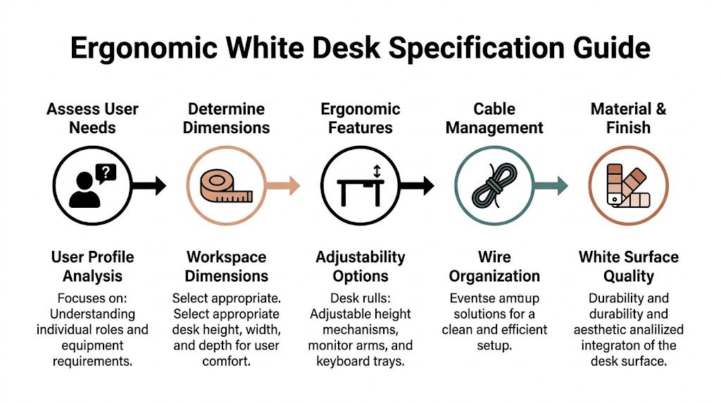
Start with baseline ergonomic dimensions
Using BIFMA G1 guidance, office desks should have a height of 28–30 inches and knee clearance depth of 20–26 inches to support 90–95% of the adult population and help prevent impingement, as noted in this desk specification reference.
That sounds basic, but it’s where a lot of projects go off track. Inadequate knee space creates complaints quickly, especially in retrofits where under-desk pedestals, cable trays, or power units eat into legroom.
Ergonomic rule: If a desk forces users to angle their knees around storage or wiring, the problem isn’t the chair. It’s the specification.
Use a simple planning sequence
A practical white desk minimalist setup usually comes together in this order:
-
Measure the usable footprint
Don’t measure the room and stop there. Measure what remains after aisles, columns, doors, panels, and shared circulation are accounted for. -
Match the desk to the work
A single-screen administrative station needs less surface than a user handling paper files, dual monitors, and constant device charging. -
Protect knee clearance early
Under-desk accessories should be planned around the user, not added wherever there’s leftover space. -
Decide on fixed-height or sit-stand
Fixed-height desks are easier to standardize. Height-adjustable desks make more sense where wellness goals, varied users, or longer computer sessions justify the added complexity.
Know where fixed height works and where it doesn’t
Fixed-height white desks are usually the easier play in high-density office areas. They’re simpler to install, easier to align across long workstation runs, and less demanding for power planning.
Sit-stand desks fit best in assigned workstations, manager offices, focused work rooms, and teams where employees spend long stretches on screen-based tasks. They can be worthwhile, but only if the wiring, monitor arms, and clearance zones are designed around the movement of the desk.
For broader ergonomic planning ideas, the guidance in how to maximize the ergonomics of office work is useful because it looks at the desk as one part of the workstation, not the whole answer.
Don’t let aesthetics shrink the desk too far
Minimalist desks often get specified too shallow because the team wants a lean look. That’s a mistake. If the top is too small for the user’s monitor distance, keyboard position, and daily materials, clutter comes right back onto the surface.
A well-scaled desk disappears visually because it fits the task cleanly. A too-small desk creates piles, adapters, and improvised side storage. That’s the opposite of minimalist.
Selecting Durable Materials and Commercial-Grade Finishes
A white desk in a home office and a white desk on a busy office floor live very different lives. One sees occasional use. The other gets bag drops, coffee rings, repeated wipe-downs, rolling chair contact, box deliveries, and sunlight from the same window every day.
That’s why material selection matters more than the color itself.
Neutral tones like white account for nearly 60% of North American furniture sales, and recommended minimalist desk specs often fall in the 40–48 inch width and 18–24 inch depth range to keep compact offices visually light, according to Eureka Ergonomic’s market and design overview. Those proportions can work well, but only if the finish and substrate are suitable for commercial use.
What to look for in a commercial white desk
In practice, the desk has to handle three things well. It needs to resist visible wear, clean up without constant touch-up, and maintain a consistent white tone across multiple stations.
For most office applications, the decision usually comes down to laminate quality, edge treatment, and frame construction. Thin consumer tops and decorative finishes often look fine in a product listing but break down once several departments share the same furniture standard.
Here’s a simple comparison framework.
| Material | Durability | Stain Resistance | Cost |
|---|---|---|---|
| High-pressure laminate | Strong choice for heavy office use | Typically dependable for routine office spills and cleaning | Higher |
| Thermally fused laminate | Good for many standard office settings | Usually solid if the finish is commercial-grade | Moderate |
| Painted MDF | More vulnerable in high-traffic environments | Can show chips, edge wear, and staining more easily | Moderate |
| Glass-top white desk systems | Surface can maintain a crisp look, but needs careful planning | Easy to wipe, but fingerprints and smudges are more noticeable | Higher |
| Powder-coated metal with white work surface pairing | Durable as part of base and frame construction | Depends on top material more than base | Moderate to higher |
The finish matters as much as the core
Many buyers focus on “white” as if all whites perform the same. They don’t.
Matte and low-sheen finishes usually hold up better in active offices because they hide dust, fingerprints, and micro-abrasions more effectively than gloss. Edge quality also matters. Poorly finished edges discolor and chip first, especially near user contact points and shared circulation paths.
If the white desk only looks good from ten feet away, it isn’t specified well enough for an office.
Where design trade-offs show up
The cleanest-looking desk isn’t always the most practical one. Slim profiles look excellent, but some ultrathin tops sacrifice rigidity. Open metal bases create visual lightness, but they also need enough structural stability to handle monitor arms and constant movement.
Glass can work in selected spaces, especially executive or client-facing rooms, but it’s not automatically the right choice for every workstation run. Teams comparing white minimalist options sometimes benefit from reviewing alternatives like tempered glass desk applications alongside laminate systems so the visual concept stays aligned with how the office operates.
For commercial projects, I’d rather accept a slightly heavier-looking desk that wears well than a fragile “minimalist” piece that starts showing damage too early. In offices, the finish doesn’t just support the design. It determines whether the design survives daily use.
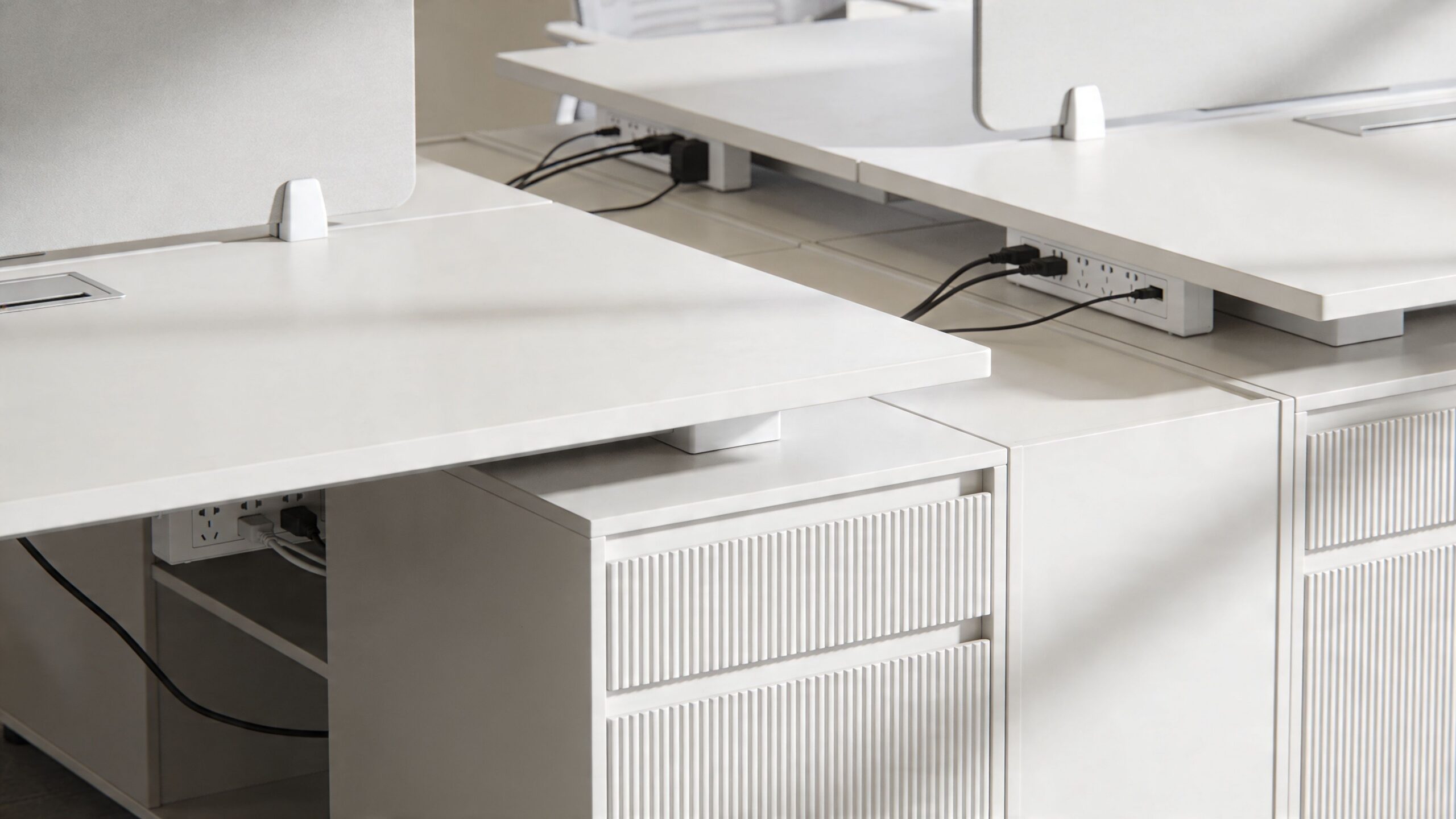
Integrating Desks with Modular Systems and Power
A white desk minimalist plan usually fails in one place. Not at the desk surface, but underneath it.
The desk can look sharp in isolation and still fall apart once power, data, privacy panels, monitor arms, and storage get layered in. A modern office needs the desk to work as part of a full system, not as a standalone object dropped into a floor plan.
Start with the workstation ecosystem
In open office planning, the desk has to align with panel heights, shared leg paths, aisle widths, and future moves. In private rooms, it has to support focused work without turning into a cable catch basin behind the return or credenza.
That’s why modular planning matters. Systems thinking keeps the desk, divider, storage, and electrical layout coordinated from the start. If you’re evaluating layouts that need that kind of coordination, modular office desk systems are worth reviewing because they frame the desk as one element inside a scalable workstation structure.
Cable control is part of the aesthetic
Minimalism doesn’t survive exposed cords. Once charging bricks, monitor cables, and floor feeds are visible, the white desk stops reading as intentional and starts reading as unfinished.
Integrating desks with under-desk power strips can reduce visible cable clutter by up to 70%, and in call centers this setup has been correlated with a 12% productivity gain tied to reduced visual distractions, according to this commercial desk integration reference.
That kind of gain doesn’t happen because the desk is white. It happens because the space is controlled. The white finish makes poor cable management more obvious, so good planning becomes even more important.
What works in real office layouts
The strongest installations usually share a few traits:
-
Power is planned before furniture placement
Floor cores, wall feeds, and user density are resolved early so the desk doesn’t end up compensating for electrical shortcuts. -
Shared workstation runs use consistent access points
If every station handles cable drop differently, the row will never look clean. -
Storage and power don’t compete for the same zone
Pedestals, CPU holders, and cable baskets need separate space or users lose legroom and usable access. -
Panel systems support the desk, not fight it
The desk should align cleanly with screens, glass elements, or privacy dividers instead of creating odd reveals and dead corners.
A simple product video helps show how integrated layouts keep the workspace cleaner once power and furniture are planned together.
Benching, private rooms, and hybrid zones need different logic
A long benching run needs repeatability. Every seat should have the same power approach, monitor support, and storage rhythm. If one user has a freestanding pedestal, another has a wall cord, and a third has a floor snake, the minimalist look is gone.
Private offices have more flexibility, but they still need restraint. Too much side storage, bulky guest seating, or oversized returns can make a white desk feel squeezed. For enclosed layouts, I usually favor fewer but better-integrated pieces.
This is also where one coordinated furniture source can help. Cubicle By Design offers modular desks, cubicles, glass walls, and planning support that let teams configure workstation dimensions, privacy, storage, and electrical options together instead of piecing them together after the fact.
Think about reconfiguration before move-in
Hybrid offices rarely stay static. Departments shift, managers add headcount, and teams swap assigned seating for hoteling or the reverse.
A white desk minimalist setup holds up better when wiring routes, panel connections, and storage units can move with the workstation. If the office can’t reconfigure cleanly, the minimalist look slowly degrades with every change order. That’s usually not a design failure. It’s a planning failure that showed up later.
Smart Storage Solutions for a Clutter-Free Aesthetic
A lot of minimalist advice gets one thing wrong. It treats storage as if it’s the enemy.
In offices, the opposite is true. Poor storage is what creates visible clutter. If staff don’t have a proper place for headsets, forms, personal items, and charging accessories, the desktop becomes the default storage unit.
That matters even more in hybrid workplaces. A 2025 IFMA report noted that 62% of facilities managers prioritize modular furniture for hybrid offices, yet most online “white desk minimalist” content still focuses on individual users rather than scalable commercial storage, as summarized in this market gap review.

Minimalist doesn’t mean empty
The right storage strategy keeps the desktop clear without making employees feel under-equipped. In practical office planning, that usually means concealed storage at the point of use, plus a shared storage layer nearby for overflow and team materials.
A few options tend to work well:
- Slim mobile pedestals for users who need daily access to supplies but not a bulky footprint
- Low shared credenzas behind benching or along perimeter walls to keep archive material off primary work surfaces
- Locker or cabinet zones for hybrid seating, where employees need a landing place that isn’t the desk itself
Storage should remove friction from the workday. If employees have to choose between convenience and a clean surface, they’ll choose convenience every time.
Keep storage proportional to the workstation
One common mistake is oversizing storage because the team wants to “be safe.” That usually backfires. Large pedestals shrink knee space, heavy overhead pieces darken the station, and deep cabinets interrupt circulation.
The better move is to separate immediate-use storage from occasional-use storage. Daily items stay within arm’s reach. Everything else moves to shared cabinetry, file walls, or adjacent support areas.
For offices trying to tighten up support spaces beyond the workstation itself, resources on office closet organizer solutions can be useful. They offer practical ideas for keeping supplies, overflow materials, and utility items out of sight so the desk area doesn’t become a catch-all.
Configure storage with the desk, not after it
Storage works best when it’s part of the initial workstation plan. That’s especially true in modular office layouts where drawer swing, panel width, and user access all affect how clean the station feels once occupied.
Facilities teams working through those combinations can use the Custom Cubicle Designer to test different balances of open desk space, privacy, and integrated storage before committing to a layout. For smaller footprints, looking at storage cabinets for compact office areas also helps because it keeps support furniture aligned with the minimalist goal instead of competing with it.
The cleanest workstation is rarely the one with the least storage. It’s the one where the storage is quiet, close, and correctly sized.
Budgeting, Installation, and Long-Term Maintenance
The purchase price of a white desk tells only part of the story. In commercial projects, the full cost shows up across delivery, installation, electrical coordination, future moves, cleaning labor, and how soon the finish starts looking tired.
That’s why I look at white desk minimalist planning as a total ownership decision. If the desk looks crisp on day one but discolors, scratches, or complicates reconfiguration, the lower upfront price won’t hold up.
Budget for the full installation, not just the furniture line
A white desk program usually works better when the budget accounts for the whole deployment. That includes freight, staging, assembly, punch corrections, field measurements, and any coordination needed around power and data access.
Three budget questions help expose weak assumptions early:
-
Will this desk install cleanly in the actual building?
Tight elevators, phased occupancy, and after-hours access can change labor requirements quickly. -
Can the same desk standard work across departments?
A clean standard reduces future mismatch and makes expansions less painful. -
What happens when the layout changes?
Hybrid offices shift. Desks that are hard to move, reconnect, or reconfigure usually create hidden costs later.
Cheap furniture often becomes expensive during the second move.
Installation quality affects the visual result
White surfaces are unforgiving. Misaligned seams, uneven reveals, sloppy wall anchoring, and crooked grommet placement all stand out more on a clean palette.
That’s why field coordination matters. Installers need the final power locations, exact workstation spacing, and storage placement decisions before the truck shows up. A minimalist office only looks effortless because somebody worked through the details in advance.
For workstation areas in particular, sequence matters. Panels or walls should align with desk placement, then power access, then storage, then accessory mounting. Reversing that order often creates awkward clearances and visible compromises.
Maintenance is where commercial-grade spec pays off
According to a 2026 Gensler Workplace Survey, 45% of US enterprises now demand low-maintenance white desks, and consumer-grade white finishes can yellow in 18–24 months under office UV exposure. That’s why commercial-grade, UV-resistant laminates matter for long-term appearance, based on this white desk durability summary.
In practice, maintenance should be simple and repeatable:
- Daily care means wiping surfaces with appropriate non-abrasive cleaners and catching spills before they sit.
- Weekly checks should catch scuffs, hardware looseness, and cable drag that can mark surfaces or edges.
- Periodic reviews should focus on lighting exposure, especially near windows or intense overhead lighting where tone changes show up faster.
What works and what usually fails
A matte or low-sheen commercial laminate usually ages better than high-gloss consumer finishes in busy offices. White desks also hold up better when users have enough storage and proper cable routing, because fewer objects scrape across the top and fewer cords drag against edge surfaces.
What fails most often is the combination of a delicate finish and a high-traffic environment. Reception-adjacent stations, shared touchdown areas, and busy administrative hubs need tougher specifications than lightly used enclosed offices, even if the furniture looks similar in the plan set.
The strongest white desk minimalist projects stay clean because the office supports the desks properly. Good dimensions reduce clutter. Good storage keeps tools off the surface. Good power planning controls wires. Good materials resist wear. When those choices line up, the minimalist look lasts instead of fading after the first quarter of use.
If you’re planning a new layout or upgrading an existing office, Cubicle By Design can help you evaluate desk standards, modular workstation options, and practical fit for your floor plan so the finished space stays functional, scalable, and easy to maintain.