
Staring at a blank floor plan can make even experienced office managers second-guess themselves. You know the stakes. If the layout is wrong, people feel it every day. Focus gets harder, meeting rooms bottleneck, noise travels, cables end up where they shouldn’t, and the office starts fighting the work instead of supporting it.
That’s why how to plan office layout isn’t really a furniture question. It’s an operations question. It affects concentration, team coordination, growth, maintenance, safety, and whether your space still works six months after move-in.
The pressure is higher in hybrid offices because the old shortcuts don’t hold up. Planning by raw headcount alone usually leads to one of two outcomes. You either pay for space people rarely use, or you cram teams into a layout that peaks badly on busy days and feels empty on the rest.
Good office planning is more practical than people expect. It starts with measured space, real attendance patterns, and honest workflow needs. Then it moves into zoning, circulation, workstation types, acoustics, visual privacy, and infrastructure. That last piece matters more than many organizations realize. A floor plan can look clean on paper and still fail once power, data, and sightlines are added.
This guide breaks the work into decisions you can make. It reflects the way planners approach live projects, where budgets, timelines, columns, door swings, and team habits all matter. If you’re planning a reconfiguration, expansion, or first office buildout, the goal is simple. Create a layout that works on busy days, adapts later, and doesn’t create avoidable problems during installation.
How to Plan an Office Layout: A Complete Guide
Monday, 9:15 a.m. The office is fuller than expected, two people are taking calls from the hallway, a project team has claimed the only quiet corner, and someone is already asking where to plug in a laptop because the floor boxes do not line up with the desks. That is how layout problems usually show up in real offices. The drawing looked clean. The day-to-day use does not.
A workable office layout starts with operations, infrastructure, and behavior. Desk counts matter, but they are not the first decision. Start with how teams use the space, where noise will travel, what needs visual separation, and how power and data will reach every setting without cords creeping into circulation paths. In hybrid offices, those details decide whether the plan holds up on busy days or starts failing in the first month.
The mistake I see most often is planning around furniture blocks before the office has clear work zones. Focus work, quick collaboration, scheduled meetings, touchdown use, and private calls place different demands on the same floor. If those functions bleed into each other, the office feels busy even when attendance is moderate.
Good planning also means accepting trade-offs early. Open areas improve visibility and can fit more shared settings, but they expose people to motion and noise. More enclosed rooms improve privacy, but they consume frontage, interrupt sightlines, and can leave workstation rows starved for daylight. Power access creates another constraint. A benching run may fit on paper and still be the wrong choice if the electrical path turns installation into a costly workaround.
That is why experienced planners test the layout as a working system before anyone signs off on product. We check circulation, adjacency, acoustic exposure, visual privacy, cable routing, and service access together. Teams using office space planning software for layout testing and infrastructure mapping catch more of these conflicts before they become change orders.
The goal is straightforward. Build a layout that supports real work, handles hybrid peaks, and does not fall apart once power, data, and people are added.
Laying the Groundwork with Data-Driven Assessment
A layout can look efficient on paper and still fail by Wednesday. The usual pattern is familiar. Too many assigned desks sit empty, the popular rooms are booked solid, and the teams who need quiet end up working beside the noisiest traffic path. The fix starts before zoning or furniture selection. It starts with a hard look at how the office is used, what the floor can support, and where power and privacy constraints will limit your options.

Measure the space you can use
Begin with the lease plan, then verify it against field conditions. Headline square footage rarely reflects planning reality. Columns, angled walls, low clearances, door swings, glazing, and base building systems all reduce what can support desks, rooms, storage, or shared settings without creating leftover space that no one wants.
I also look at the floor through two filters that get missed in early planning. First, where can power and data reach with reasonable installation effort. Second, which areas can support quiet work without constant visual exposure or foot traffic. Those two checks eliminate a surprising number of bad workstation locations before anyone starts counting seats.
A practical assessment should document:
- Usable work areas: Space that can hold workstations, enclosed rooms, tables, or lounges without producing awkward gaps.
- Fixed constraints: Columns, core elements, windows, stairs, elevators, and structural walls.
- Infrastructure conditions: Floor boxes, perimeter power, data entry points, ceiling access, HVAC limitations, and lighting layout.
- Support spaces: Reception, storage, print areas, IT locations, pantry, mail, and janitorial needs.
- Access and code impacts: Primary entries, egress routes, delivery paths, accessibility clearances, and installation restrictions.
Old PDFs and rough sketches are a common source of errors. Teams that want to test workstation counts, circulation widths, and infrastructure fit before ordering product should use office space planning software for layout testing and infrastructure mapping rather than sketching over a static plan.
Assess demand by behavior, not by org chart
Headcount is only a starting point. It does not tell you how many people show up on the same day, how long they stay, whether they spend the day on calls, or how many enclosed settings they need to do their work well.
A better assessment tracks attendance patterns, role behavior, meeting frequency, privacy needs, and peak overlap days. In hybrid offices, peaks matter more than averages. A floor that feels fine at typical occupancy can break down fast when project teams, managers, and clients all converge midweek.
This is also the stage to separate acoustic needs from simple seating needs. Finance, HR, legal, and leadership teams often need stronger speech privacy and better sightline control than a standard benching plan can provide. Support and sales teams may tolerate more activity, but they place heavier demand on phone rooms, small meeting spaces, and nearby power for temporary touchdown use.
Use a planning inventory like this:
- Attendance pattern by team: Who is resident, who rotates, and which days create peak demand.
- Work mode by role: Focus work, processing, calling, collaboration, client meetings, or mixed use.
- Privacy threshold: Which teams need enclosed rooms, high panels, visual screening, or acoustic separation.
- Adjacency needs: Which groups need fast access to one another to solve problems quickly.
- Growth assumptions: What the office should support over the next few years so you do not force a partial reset too soon.
A good floor plan reflects daily behavior, not just employee count and a furniture schedule.
Use benchmarks carefully
Benchmarks help with early modeling, but they are not design answers. A desk ratio that works for a software team with staggered attendance can fail for a client-facing group that coordinates in person on the same two days every week. Room ratios create the same problem. On paper, the count may look balanced. In practice, a few undersized rooms or poorly placed booths can push private calls into open areas and make the whole floor feel louder than it is.
Use benchmark ranges as a first pass, then pressure-test them against booking data, observed attendance, and team interviews. Check whether the floor has enough enclosed settings for confidential work, enough plug-in points where people land without reservations, and enough buffer between quiet areas and circulation. Those details decide whether the office works under peak conditions or only during a polished walkthrough.
What teams often miss at this stage
The early mistakes are predictable, and they are expensive to correct later:
- Counting seats before confirming power paths and data access
- Treating all open area square footage as equally usable
- Underestimating how visible traffic disrupts focus seating
- Assuming phone demand can be absorbed by meeting rooms
- Planning for average attendance instead of overlap peaks
- Ignoring future changes in team mix, not just team size
A sound assessment gives you a usable planning base. It shows what the floor can support, where the constraints are, and which trade-offs are worth making before layout work gets too far ahead of reality.
Creating Zones and Mapping Your Office Flow
Monday at 9:15 a.m. is where weak layouts get exposed. People arrive for the same in-office day, the first calls start, someone heads to the pantry, two managers pull a quick huddle into the aisle, and the quiet team by the main path loses half the morning to interruption. The floor plan may have looked balanced on paper. The flow was wrong.
Good zoning fixes that. It sets expectations the moment someone walks in. People should know where to take a call, where to do focused work, where to meet without disturbing others, and how to move across the office without cutting through concentrated work.
Start with behavior, then draw the zones
Teams do not experience the office as a collection of furniture symbols. They experience it through noise, visibility, and interruption. That is why zoning by work mode produces better layouts than zoning by department name alone.
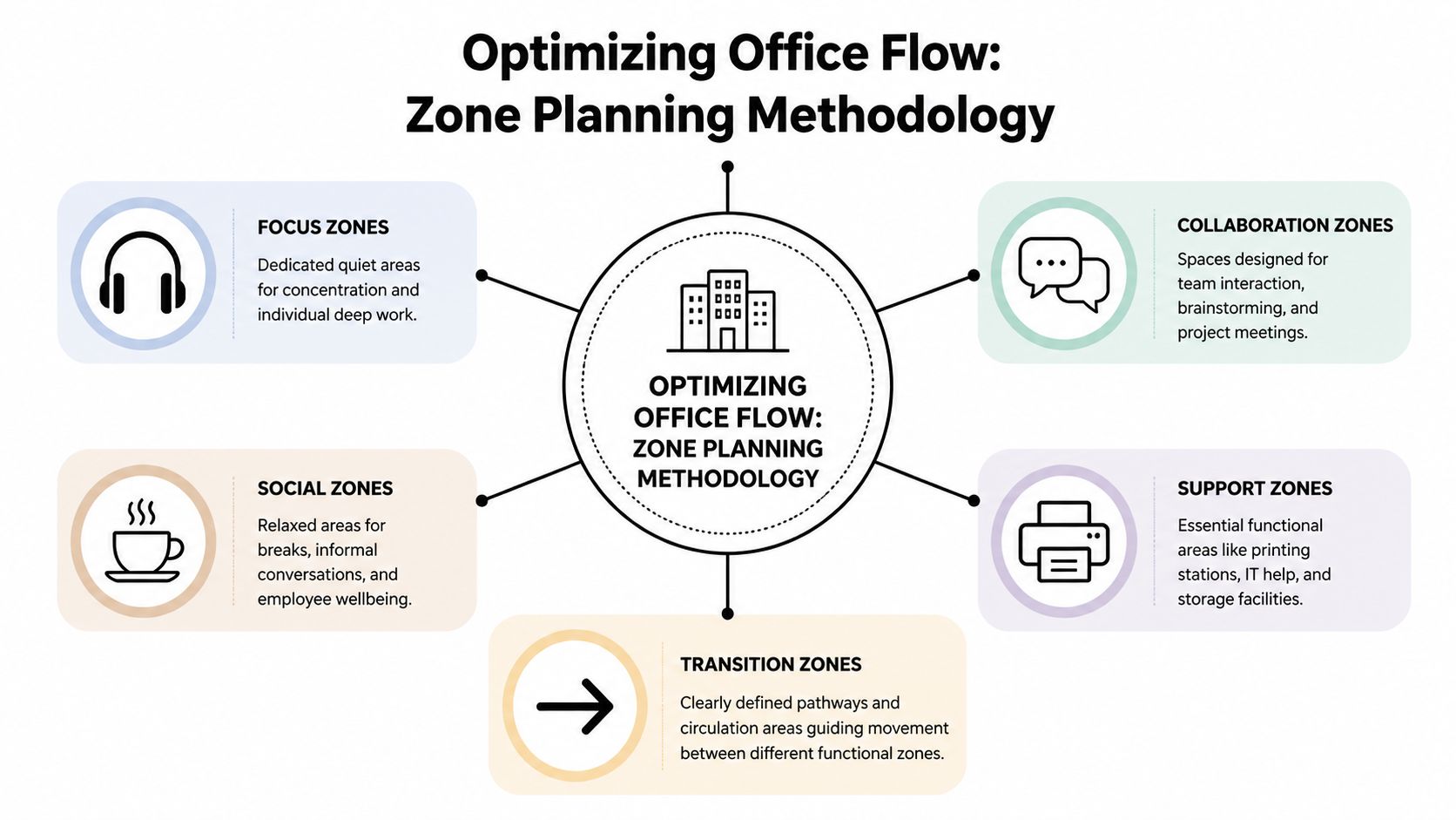
A practical office plan usually needs five zone types:
- Focus zones: Quiet desks, high-panel workstations, enclosed pods, or library-style tables for sustained individual work.
- Collaboration zones: Huddle rooms, project tables, whiteboard areas, and short-meeting spaces.
- Social zones: Pantry seating, coffee points, lounge areas, and informal gathering spots.
- Support zones: Print, storage, IT help points, supplies, lockers, and utility spaces.
- Transition zones: Main paths, secondary circulation, entries, and buffer areas between louder and quieter settings.
The mistake I see often at Cubicle By Design is treating social and collaboration space as interchangeable. They are not. A lounge near the pantry invites lingering conversation. A project table needs easy access to teams who use it often. Put either one in the wrong place, and the noise spreads farther than the square footage suggests.
Build visual and acoustic layers into the plan
Zoning is not only about where people sit. It is also about what they see and hear from that seat.
A workstation beside a busy corridor usually feels louder than the decibel level alone would suggest because motion keeps pulling attention. The same team can perform well in an open area if the traffic path is behind a screen, storage wall, planter line, or meeting room frontage. Visual control matters almost as much as acoustic control.
Use that deliberately:
- Put quiet work deeper in the plan, away from entries, pantries, and heavily used meeting rooms.
- Place active team areas where short conversations will not spill into focus seating.
- Use enclosed rooms, storage banks, booths, or partial-height dividers as buffers between incompatible activities.
- Keep sightlines clean for wayfinding, but avoid long direct views from main circulation into heads-down work areas.
For examples of how these relationships play out in real layouts, review a floor plan of the office before finalizing zone boundaries and seat counts.
Place teams by interruption tolerance, not org chart alone
Adjacency still matters. Sales may need quick access to marketing. Operations may need to sit near support functions. HR, finance, and legal usually need more control over privacy and pass-through traffic.
The better test is operational, not political.
| Team Characteristic | Planning Question | Layout Implication |
|---|---|---|
| Collaboration intensity | Do people solve issues through frequent live discussion? | Place near meeting rooms, project tables, and team touchdown space |
| Privacy sensitivity | Do they handle confidential or concentration-heavy work? | Move away from main paths and give them more enclosure |
| Visitor frequency | Do guests or internal drop-ins show up often? | Keep closer to reception or shared meeting areas |
| Call volume | Are short calls constant throughout the day? | Add nearby booths and avoid placing them beside quiet neighborhoods |
| Noise tolerance | Can the team work well in an active setting? | Use more open planning and lighter screening |
This exercise usually reveals a trade-off that gets missed early. The team that benefits from central placement is often also the team that creates more movement and talk. Give them visibility, but do not make them the hallway everyone else has to pass through.
Map circulation and plug-in points at the same time
Traffic planning and power planning belong together. If people land in a touchdown seat with no easy access to power, they relocate, drag cords into walkways, or occupy the wrong area for longer than intended. That changes the flow of the whole office.
Main routes should connect entry, meeting rooms, social space, and support functions without crossing through focus areas. Shared destinations should sit where people can reach them directly. Secondary paths can serve team neighborhoods, but they should not become shortcuts to the pantry or printer bank.
A few practical checks catch problems early:
- Trace the busiest path at peak arrival. If it runs through quiet seating, revise the plan.
- Check where people will stop, not just where they will walk. Printers, lockers, coffee points, and booths create small clusters that need breathing room.
- Confirm power access in every unassigned work setting. Hybrid offices fail fast when touchdown seats look usable but cannot support a laptop and monitor without extension cords.
- Separate booth queues from desk rows. A phone booth beside focused work creates its own noise line, even if the booth itself is enclosed.
Test the plan under real conditions
A layout should survive peak overlap, not just a tidy rendering. Run through the common scenes before anything is ordered. Morning arrivals. Back-to-back video calls. Visitors being escorted to a meeting room. A project team standing around a whiteboard. Facilities staff restocking supplies during working hours.
Small adjustments usually make the difference. Shift a corridor six feet. Rotate a workstation bank. Move a booth cluster closer to a call-heavy team. Add a storage wall between the pantry edge and focus seating. Those are minor drawing changes. In use, they decide whether the office feels organized or constantly in conflict.
Strong office flow is usually quiet in the best sense. People move easily, plug in where they expect to, find the right setting for the task, and disturb fewer coworkers on the way there.
Choosing the Right Workstations for Your Teams
The workstation decision shapes daily experience more than almost anything else in the office. It determines how much visual interruption people absorb, how easily teams talk, how confidential conversations stay, and whether the office feels workable by noon or draining by ten in the morning.
That’s why defaulting to open plan just because it looks modern usually backfires. Open-plan offices may fit more people into less space, but they often create performance problems. According to Niche Projects’ review of open-plan office data, open offices are associated with a 70% drop in face-to-face interactions, a 37% decrease in productivity due to noise and distractions, and 76% of employees do not recommend open-plan setups.
Start with the role, not the furniture trend
A workstation should match the work. Call-heavy, client-facing, detail-intensive, and leadership roles all ask for different levels of privacy and enclosure.
Here’s the planning mistake I see most often in reconfigured offices. Teams choose one workstation style for the whole floor because purchasing is easier that way. Then they try to solve the resulting privacy and noise problems with policy. Policy can help, but it can’t overcome a mismatched physical setup.
The stronger approach is mixed typology. Use more than one workstation type across the office, based on role and task.
Workstation Type Comparison
| Workstation Type | Best For | Privacy Level | Cost Efficiency | Space Density |
|---|---|---|---|---|
| Open benching | Short-duration touchdown work, highly interactive teams, overflow seating | Low | High | High |
| Mid-panel cubicles | Mixed-use departments that need some focus and some visibility | Medium | Good | Moderate |
| High-panel cubicles | Concentration-heavy teams, call work, admin processing, support functions | High | Moderate | Moderate |
| Glass-front private office cubicles | Managers, HR, confidential work, small leadership offices | High with visual openness | Lower than open benching | Lower |
| Shared workstation clusters | Teams that need proximity with moderate separation | Medium | Good | Good |
Real product categories matter. If you’re comparing enclosed versus semi-open options, review cubicles and workstations alongside specific product layouts rather than relying on generic inspiration boards.
Where each option works best
Open benching
Open benching works best when teams use the office for short collaborative sessions, quick touchdown work, or rotating presence. It’s less effective for all-day occupied roles that require concentration or privacy. The problem isn’t openness itself. The problem is using openness as the only setting available.
Traditional and modular cubicles
Cubicles still solve problems that open offices don’t. They create a defined work boundary, support acoustic separation, and reduce constant line-of-sight interruption. For many hybrid offices, mid-height or higher-panel systems offer the right balance between density and usability.
If you’re evaluating broad options, it’s worth browsing modular office cubicles to compare panel heights, storage, and reconfiguration potential.
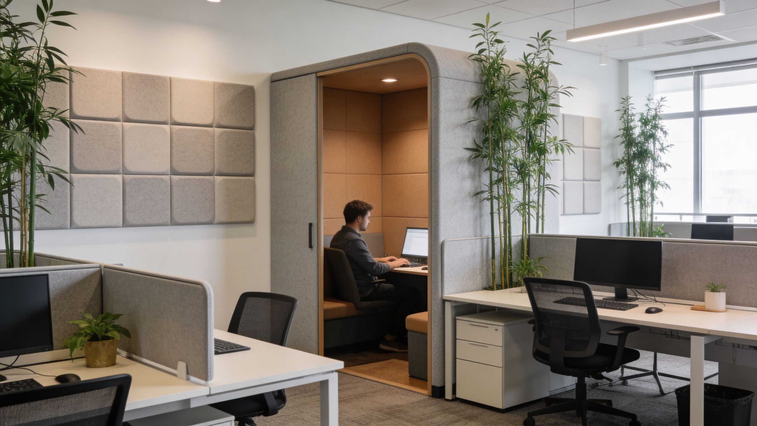
Private office cubicles with glass
For teams that need confidentiality but don’t want the floor to feel closed off, private office cubicles can work well. Glass maintains daylight and visual openness while still creating a real boundary for calls, reviews, and focused work.
This format is especially useful for HR, finance, managers, and client-facing roles that need enclosure but not a permanent drywall buildout.
Team-oriented workstation clusters
Some teams don’t need full enclosure. They need local proximity with enough separation to stay functional. Workstation cubicles are often a practical middle ground for departments that collaborate often but still spend a large share of the day in individual work.
The right workstation mix usually feels less uniform on the plan and more successful in daily use.
A better question than “How many desks fit?”
Ask this instead: what kind of work should this area protect or encourage?
That shift changes the discussion. You stop treating desks as inventory and start treating them as work settings. Once that happens, workstation selection becomes easier. The answer for accounting usually won’t be the answer for business development. The answer for a quiet analyst pod won’t be the answer for a project hub.
Offices perform better when the workstation strategy admits that difference.
Managing Acoustics Privacy and Visual Distractions
Noise gets most of the attention in office planning. It should. But it isn’t the only thing pulling people out of their work. Visual interruption does damage too, especially in hybrid offices where layouts are often designed to look open and flexible first, then forced to handle concentration later.
According to Gable’s guidance on making open office design work, visual clutter can add an unmeasured 10-20% to cognitive load, 55% of global enterprises report worker burnout from poor visual zoning, and sightline management that keeps visual overlap into focus zones below 10% can boost wellbeing by 18%.
Sightlines need planning, not guesswork
A quiet area can still fail if every seated employee sees motion in three directions. That’s common in offices where focus desks face a main corridor, a coffee point, or a collaborative hub. The room may sound acceptable, but attention keeps getting pulled by movement.
The fix isn’t always building more walls. Usually it’s about managing what people can see from their primary work position.
Use a few practical tactics:
- Angle desks away from major traffic lanes so seated workers don’t face constant motion.
- Create buffer edges with storage, planters, low shelving, or partial screens between active and focused zones.
- Use frosted or semi-opaque elements where privacy is needed without fully blocking light.
- Avoid direct sightlines from entries into concentration areas whenever possible.
Acoustics and visual privacy should work together
Too many offices handle these separately. Someone adds acoustic panels later, but the layout still exposes people to every passing conversation and every movement in the room. The result is technically quieter, but not calmer.
That’s why the strongest privacy solutions combine enclosure, material choice, and placement. A small quiet pod near a loud hub won’t work if people queue beside it. A glass meeting room may look excellent, but if it sits directly against a focus bank with no transition, both spaces suffer.
For teams evaluating enclosed boundaries, door swing, sound containment, and transparency options in meeting areas, this guide to conference room door solutions is useful because it shows how entry systems influence privacy, access, and room performance.
Good privacy planning doesn’t mean hiding people. It means deciding where interruption is acceptable and where it isn’t.
A second layer is surface and panel strategy. High-backed seating, acoustic panels, glass fronts with selective frosting, and strategically placed partitions all help. So do workstation systems built with actual acoustic intent rather than purely visual styling. If you’re reviewing options for panels, dividers, and enclosure strategies, office acoustics solutions can help frame what belongs in focus areas versus open collaboration zones.
A quick visual example helps make the difference clear:
Buffer zones are what keep open plans usable
Buffer zones are transitional spaces that absorb activity before it reaches people who need to focus. They can be as simple as a copy point, storage wall, touchdown counter, or short lounge edge placed between an energetic zone and a quiet one.
They matter most in these locations:
- Outside meeting rooms where people gather before and after sessions
- Between pantry areas and workstation neighborhoods
- At the edge of major corridors
- Around open collaboration tables
Without these buffers, activity spills directly into heads-down seating. With them, the office feels far more intentional even when occupancy rises.
Integrating Power Data and Essential Infrastructure
A layout can survive an imperfect lounge area. It usually won’t survive bad infrastructure planning. When power and data are treated as something to “figure out later,” the project starts absorbing change orders, awkward floor penetrations, visible cabling, and furniture compromises that should have been avoided on day one.

That risk is well documented. According to Cubicle By Design’s guidance on small office layout planning, 68% of facilities managers report that cabling retrofits cause 20-30% of all project delays and budget overruns, and integrating power into modular systems from the start can speed installation by as much as 25%.
Plan infrastructure at the same time as furniture
Don’t approve workstation runs without knowing where power enters, how data reaches each cluster, and what equipment load each zone needs. Modular systems can support cleaner wiring, but only if the infrastructure path is coordinated in advance.
A practical early audit should answer:
- Where are base building power sources and data drops located
- Which teams need the highest device density
- Which areas need floor access versus wall-fed power
- How will cable runs stay code-compliant and maintainable
- What needs to stay flexible for future reconfiguration
Planning tools play a significant role. If you’re laying out powered workstation runs or trying to avoid exposed feeds, a cubicle power pole is one of the elements that should be considered during the plan stage, not after furniture arrives.
Infrastructure should support the environment, not fight it
Power and data also connect to comfort and building performance. A crowded workstation bank with poor cable management can block access, complicate cleaning, and create heat and clutter issues around equipment-heavy zones. That’s one reason it helps to coordinate furniture planning with HVAC and environmental conditions instead of treating them as separate silos.
For teams reviewing ventilation and occupant comfort alongside layout choices, this resource on comprehensive air quality information is a useful reference because air movement and equipment density affect how a space feels once it’s occupied.
What works in the field
The most reliable installations share a few habits:
- They assign infrastructure ownership early. Someone is responsible for power, data, and coordination with the furniture plan.
- They specify electrical options with the workstation package. This avoids last-minute substitutions.
- They leave paths for future change. Hybrid offices rarely stay frozen.
- They test difficult areas first. Corners, odd wall conditions, and glass-front zones usually need extra coordination.
This is also one place where product configurators help. The Custom Cubicle Designer can be used to model dimensions, privacy levels, finishes, storage, and electrical options before procurement, which is much more useful than trying to solve infrastructure conflicts during installation.
Executing Your Plan with Budgets and Timelines
A solid office layout still needs a realistic rollout. Good planning can fall apart during execution if budget assumptions are thin, lead times are ignored, or the install sequence forces teams to work through unnecessary disruption.
Start by separating the project into decision groups. Furniture, infrastructure, delivery access, installation labor, technology coordination, and contingency should all be visible. If those costs are blended too early, teams usually underprice the hard parts and overfocus on the workstation count.
Phasing often works better than a single all-at-once install, especially in active offices. One area can be built and tested while another stays operational. That approach gives you a chance to catch circulation issues, storage misses, or room-use problems before they spread across the full floor.
Timelines also improve when communications are handled like an operations project rather than a furniture drop. Teams need to know what moves when, what gets disconnected, where they sit during each phase, and which support functions stay live. If your layout includes hybrid workrooms or phone-intensive departments, it’s also smart to align the furniture plan with communications infrastructure. For example, businesses comparing room and desk communication setups may find this overview of a cloud phone system for businesses useful while finalizing how meeting rooms, private offices, and shared stations will operate.
The goal isn’t perfection on paper. It’s a layout that can be installed cleanly, used immediately, and adjusted without drama. That’s what separates a good concept from a workable office.
If you’re ready to turn a floor plan into a practical workplace, Cubicle By Design offers modular product options, layout tools, and planning support for offices that need to balance privacy, flexibility, power integration, and real-world installation constraints.