


You're probably looking at a long strip on a floor plan that seems easy to measure and oddly hard to use. A 10 x 24 area looks straightforward until you start placing desks, accounting for door swings, preserving privacy, and figuring out where people will move without bumping into panels or each other.
That's why this footprint deserves more attention than it usually gets. A narrow, elongated workspace can become an executive office, a shared manager zone, a focused team pod, or a dense workstation run. The result depends less on the square footage alone and more on how carefully the layout is shaped around circulation, storage, panel height, and power access.
10 X 24 Office Layout Perfect Workspace Guide
Unlocking the Potential of Your 10×24 Space
A 10 x 24 workspace equals 240 square feet and sits in a very different category than a standard staff station. In office planning, that size is typically associated with senior management or executive use, and it's nearly seven times the floor space of a standard 6×6 entry-level workstation. With 85-inch panel heights, it can also provide full standing privacy for sensitive work such as HR, finance, and concentrated leadership tasks, according to cubicle dimension standards summarized here.
That changes the conversation immediately. This isn't just a leftover rectangle near a window wall or an awkward run beside a corridor. It's a footprint with enough depth and length to support distinct zones inside one enclosure, if you plan it intentionally.
Why the Shape Works Better Than It First Appears
The challenge is obvious. 10 feet is narrow enough that bad furniture choices can choke movement fast. The advantage is less obvious, but more useful. 24 feet gives you room to sequence the space instead of forcing every function into one cluster.
A long footprint works well when you assign roles to segments of the room:
- Front zone for arrival or guest seating
- Middle zone for the primary workstation
- Back zone for storage, filing, or secondary work surfaces
- Edge space for circulation that doesn't cut through the work area
That's why this size often performs better than a more square room with the same rough planning ambition. A square room can become visually busy. A long room encourages order.
Practical rule: In a 10 x 24 space, the plan improves when movement follows the room instead of crossing it.
Lighting matters more than is commonly expected in this footprint. Long, narrow rooms can feel dim at one end and overlit at the other, especially under lower ceilings. If you're working through fixture choices, this guide on lighting low ceilings effectively is worth a look because it addresses a problem that shows up often in converted office suites.
The Best Use of the Space Depends on the Job
What works in a 10 x 24 footprint isn't universal. A private executive office benefits from enclosure, guest seating, and deeper storage. A team zone benefits from shorter visual barriers and better shared access. A support row benefits from repeatable module planning and disciplined cable routing.
For smaller footprints elsewhere in the office, it also helps to compare this room against other compact planning strategies. These office design ideas for small spaces are useful because they highlight where density helps and where it starts to work against function.
Measure Twice Design Once Your 10×24 Blueprint
Most layout mistakes in a 10 x 24 area start before any furniture is selected. The room gets measured as a simple rectangle, then the specific conditions show up later. A door swings deeper than expected. A column lands in the only clean panel run. Existing outlets sit in the wrong place. By then, every revision gets slower and more expensive.
Start with the room as it exists, not the room you wish you had.
Build a Site Map Before You Build a Layout
Begin with the basic dimensions, then add the details that control design decisions.
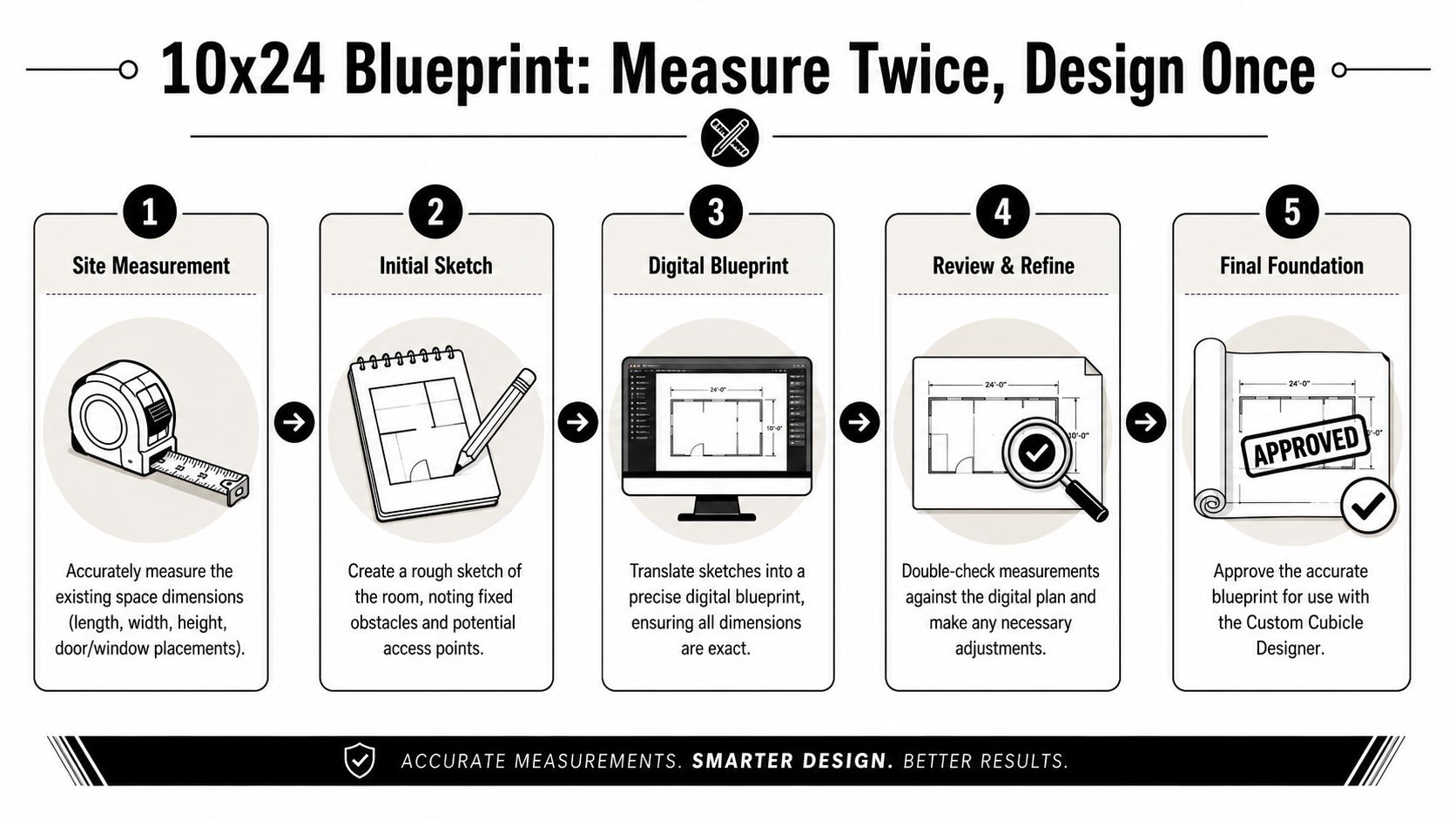
A useful site map should include:
- Room dimensions. Confirm the full length, width, and ceiling height, not just what appears on an old plan.
- Openings. Mark doors, window lines, sidelights, and any trim or casing that affects panel placement.
- Fixed obstacles. Note columns, sprinklers, thermostats, returns, radiators, wall switches, and anything else that can't be moved easily.
- Power and data points. Existing floor boxes, wall outlets, and cable paths often determine where the main workstations should go.
- Traffic paths. Record how people already enter, cross, or pass the area.
A rough hand sketch is fine at first. It just needs to be accurate enough to prevent assumptions.
Zone the Space Before Choosing Products
After measurement, divide the room by use, which allows many layouts to strengthen fast because zoning exposes conflicts early.
A practical 10 x 24 zoning exercise usually separates the footprint into:
- Primary work zone for desks and chairs
- Secondary support zone for storage, printer access, or touchdown space
- Conversation zone for side chairs or quick standing meetings
- Circulation path that remains clear without cutting through someone's workstation
The reason to zone first is simple. If you pick products before functions, you start forcing pieces into the room. If you zone first, the furniture serves the plan.
A clean blueprint usually feels almost boring on paper. That's a good sign. Complicated plans tend to create complicated installations.
If you're organizing your measurements into a usable plan, this guide on how to plan office layout is a strong next reference because it helps translate raw measurements into an actual layout decision.
What to Double Check Before Approval
Before moving into digital design, verify the items that cause the most rework:
- Ceiling conditions so taller elements don't conflict with building features
- Door clearance so seated users and guest chairs don't sit in the swing path
- Window alignment so panels don't block useful light unintentionally
- Outlet location so power doesn't end up stretched across walkways
A 10 x 24 room rewards precision. The footprint is large enough to do serious work, but narrow enough that small measuring errors ripple through the whole layout.
Layout Blueprints for Your 10×24 Workspace
A 10 x 24 workspace can be planned in several completely different ways, and that's the main reason this footprint is so useful. The right answer depends on the work style. Quiet leadership work needs one kind of enclosure. Team throughput needs another. Trying to make one layout satisfy both usually leaves everyone frustrated.
In denser planning scenarios, a 10' x 24' cubicle footprint can support 6–8 workstations, and acoustic performance success rates exceed 88% when using Compact Grade Laminate (CGL) or High Pressure Laminate (HPL) panels for high-density environments, based on the specification summary cited here. That doesn't mean every 10 x 24 should be packed that tightly. It means the footprint has real flexibility if the use case justifies it.
Four Practical Layout Directions
Below is a side-by-side planning view.
| Layout Option | Max Occupancy | Privacy Level | Best Use Case |
|---|---|---|---|
| Executive Suite | 1 | High | Private leadership office with guest seating |
| Power Duo | 2 | Medium to High | Two managers or lead staff who need separation |
| Four-Person Team Hub | 4 | Medium | Project team collaboration with defined personal space |
| High-Density Run | 6–8 | Low to Medium | Sales, support, or call-focused workstation row |
The Executive Suite
This layout treats the room as a private office rather than a cubicle cluster. The best version places the main desk deeper into the room, with guest seating toward the entry and storage along one long side or the back wall.
What works
- Strong visual control and privacy
- Space for lateral filing, credenzas, or a meeting edge
- Better use of taller panels or glass-fronted enclosures
What doesn't
- It underuses the occupancy potential of the footprint
- Poor furniture scaling can make the room feel like a hallway
Larger modular elements and custom dimensions are advantageous here. The footprint also makes comparing broader planning references, like Tanger's expert business solutions, useful, as they demonstrate how furniture planning and circulation need to work together.
The Power Duo
Two users can share a 10 x 24 footprint effectively if each station gets its own orientation and storage logic. The common mistake is splitting the room exactly in half and assuming symmetry will solve everything. It won't. One side usually needs more cabinet depth, one side gets the better daylight, and both users need movement that doesn't cross the other's desk.
A better duo layout gives each person a defined territory, then places shared storage or a small touchdown counter between zones or at one end.
If two managers share this footprint, plan for privacy first and visual balance second.
The Four-Person Team Hub
This option performs well for project groups, admin teams, or hybrid teams that need assigned space without full enclosure. Four stations can fit comfortably when the furniture is compact, storage is disciplined, and circulation is preserved along one side instead of weaving through the middle.
This layout benefits from:
- Lower or mixed-height panels
- Shared whiteboard or pin-up surfaces
- Mobile storage instead of oversized fixed cabinets
The team hub tends to feel best when the room supports focus without pretending to be fully private.
The High-Density Run
If the goal is headcount, this is the most efficient path. A long workstation run can support call, support, scheduling, or sales work, especially with repeatable modules and managed cable paths. For these applications, small office layout ideas can help compare where density is practical and where it starts to hurt usability.
The trade-off is predictable. You gain seats and lose individual privacy. You also need to be stricter about panel material, acoustics, and storage discipline. In such scenarios, custom office cubicles, call center cubicles, and compact workstation cubicles usually outperform oversized desks that were never meant for narrow runs.
Choosing Panels Furniture and Storage Solutions
Once the layout direction is selected, the next decisions shape how the room feels to use. In a 10 x 24 footprint, panels, furniture, and storage don't act like separate categories. Each one changes privacy, sightlines, circulation, and the amount of usable surface area left in the room.
A larger non-standard enclosure is achievable with modular systems that offer 24-inch panel widths, including systems such as the O2™ Series, which makes it possible to build footprints that go beyond typical 8×8 or 10×10 executive ranges, as noted in this modular office furniture reference.
Panel Choices Set the Tone First
The panel decision should come before accessories. Height and material do the most to define whether the room behaves like an office, a team pod, or a station run.
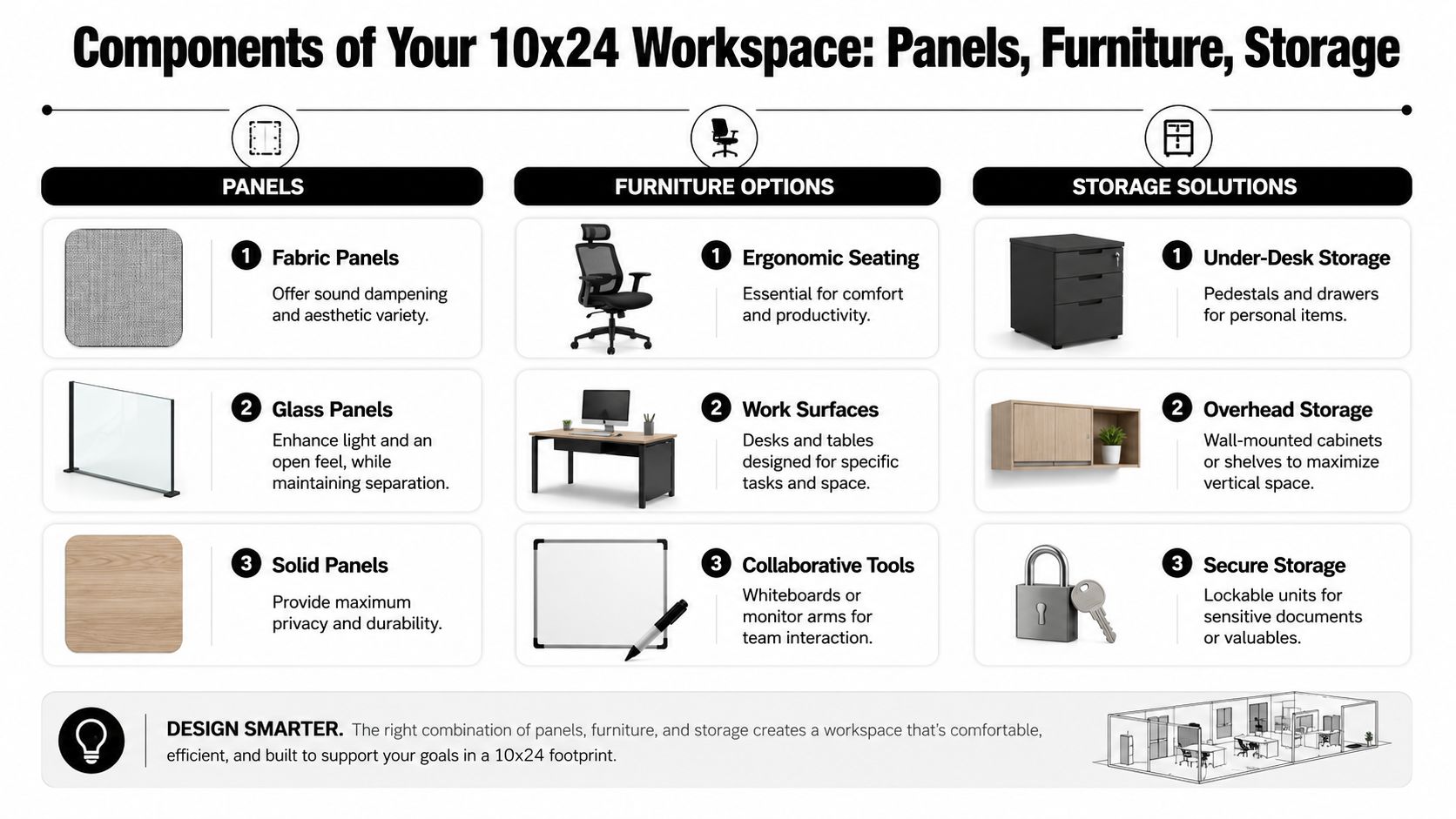
Three common panel directions solve different problems:
- Fabric panels help soften sound and add finish variety. They work well when the room needs some acoustic control but not full visual separation.
- Glass panels preserve light and keep a long footprint from feeling closed in. They're especially useful when the room borders windows or interior glazing.
- Solid panels create the strongest sense of enclosure and hold up well where privacy or durability leads the priority list.
For teams comparing panel systems, these office cubicle panels provide a good planning reference because panel style affects much more than appearance.
Furniture Has to Earn Its Footprint
A 10 x 24 room gets crowded quickly when desks are selected in isolation. Deep worksurfaces, return sizes, and chair movement all need to be tested against the circulation path.
Good furniture choices usually include:
- L-shaped worksurfaces when one user needs more task separation
- Straight desks with overhead support when the layout is shared
- Sit-stand surfaces when ergonomics matter more than maximum storage
- Monitor arms to free back-edge desk depth
Poor choices usually involve oversized freestanding casegoods that interrupt the long axis of the room. They look substantial in a product photo and become obstacles on site.
Storage Should Support the Layout, Not Fight It
In this footprint, storage works best when it follows the wall line, lives overhead, or rolls under the desk. Large side cabinets are usually where circulation starts breaking down.
A practical storage mix often includes:
- Mobile pedestals for daily-use personal storage
- Overhead bins or shelving where vertical use makes sense
- Lockable units for records or sensitive material
- Shared credenzas at the end of the run instead of between seats
The cleanest 10 x 24 layouts usually hide clutter by design. They don't rely on people staying unusually tidy.
If the room needs daylight and separation at the same time, glass office partitions are often the most balanced answer. If the room needs denser occupancy, workstation cubicles and compact custom office cubicles tend to use the long footprint more effectively than residential-style office furniture.
Power Data and Compliance Essentials
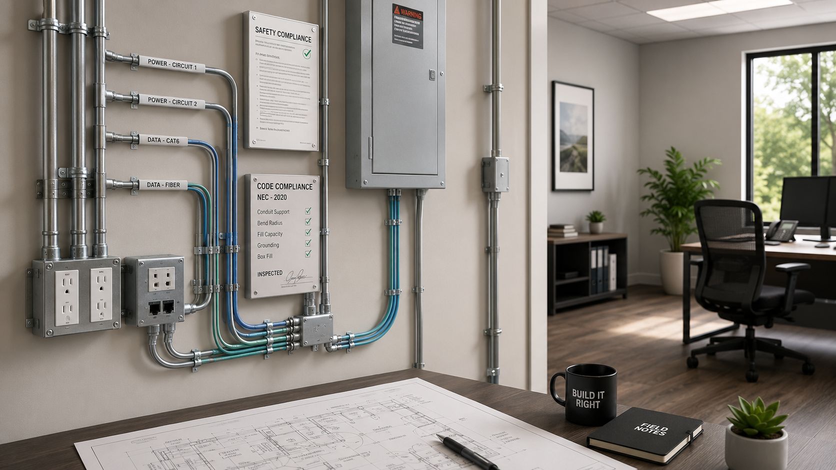
The best-looking layout can still fail in the field if power and compliance weren't solved early. A 10 x 24 footprint is particularly unforgiving because the long shape magnifies every routing mistake. One bad outlet assumption or one blocked path can affect the entire run.
A key concern is accessibility. Existing guides often address individual cubicles and common aisle standards, but they rarely address how a 10-foot-wide row in a 24-foot-long zone affects wheelchair circulation and desk clearance. That gap creates a real compliance risk in narrow floor plans, as discussed in this overview of cubicle dimensions and access considerations.
Power and Data Need a Route, Not Just a Source
Many teams think power planning is solved once they identify where electricity enters the room. It isn't. The key lies in how power and data travel cleanly to each station without creating visible clutter or future service headaches.
What usually works in a 10 x 24 layout:
- Base-fed power paths that follow panel lines instead of crossing open floor
- Integrated raceways that keep data and power coordinated
- Station grouping by equipment type so high-use areas aren't scattered
- Early coordination with IT and facilities before panel placement is finalized
What usually goes wrong:
- Desk locations get approved before device counts are known
- Power access is treated as an after-install issue
- Data drops are pushed to the perimeter, then stretched awkwardly back into the room
Accessibility Has to Be Tested in Plan View
The problem with narrow layouts isn't just whether an aisle exists. The problem is whether a person can move, turn, approach the desk, and use the workstation without the room narrowing at the wrong point.
That means checking:
- Entry path continuity
- Clearance behind task chairs
- Desk approach zones
- Any pinch points created by storage, returns, or panel corners
For teams reviewing broader workplace safety and compliance obligations, these OSHA cubicle requirements help frame the practical side of safe planning.
A compliant plan should still feel usable in daily work. If circulation only works on paper, the layout isn't finished.
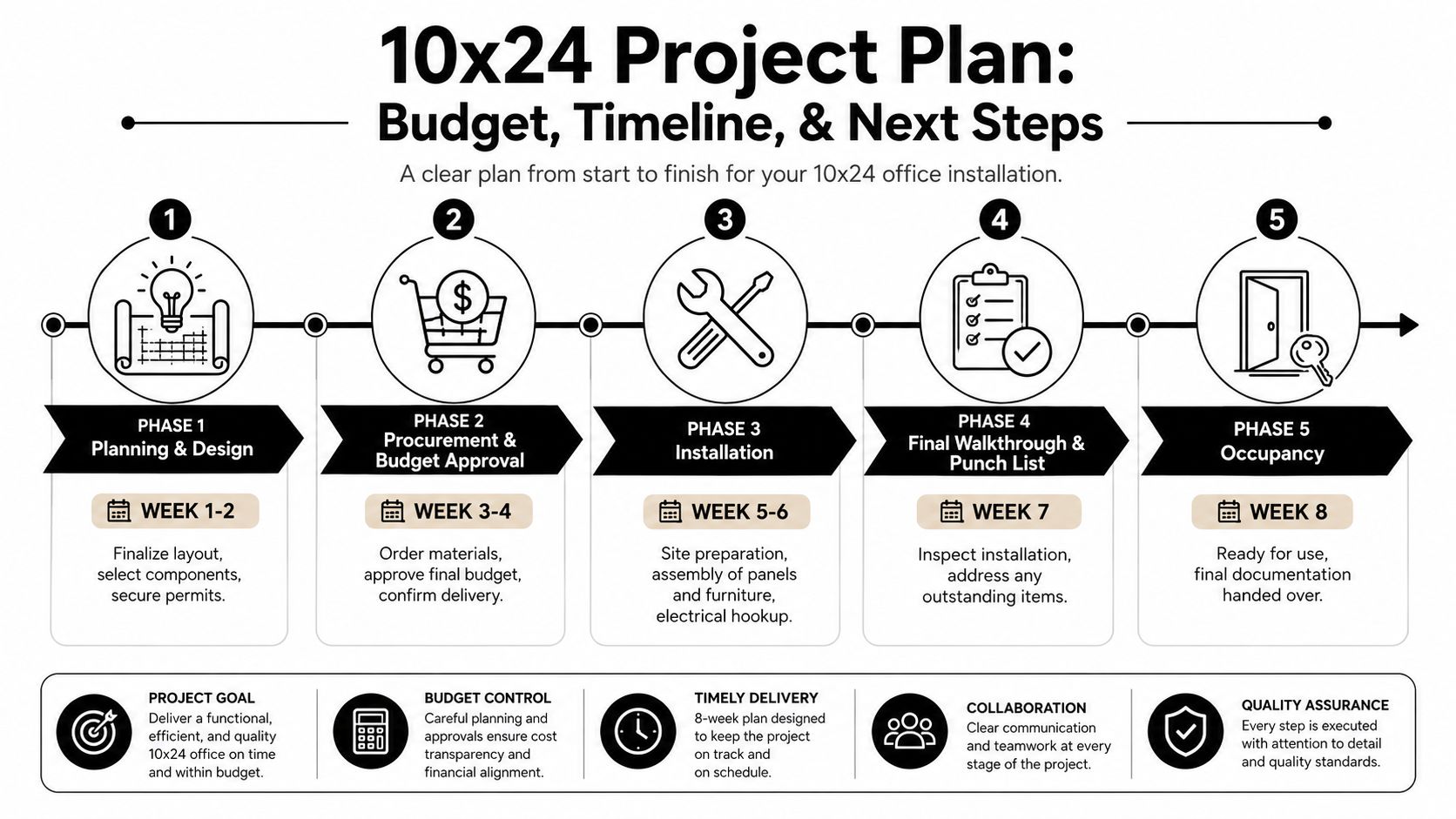
Your Project Plan Budget Timeline and Next Steps
A 10 x 24 project stays on track when the room is defined before product is priced. In a long, narrow footprint, a small change in panel depth, aisle width, or storage placement can force a full redraw. I advise clients to approve one layout direction first, then price the matching panel system, worksurfaces, storage, and electrical package against that plan.
Installation planning also needs more attention in a 24-foot run than it does in a shorter room. At Cubicle By Design, we specify mid-end support blocks instead of relying on top connectors alone when a panel line carries length across the space. That added support helps keep the run aligned, reduces panel movement during assembly, and protects the finished installation from sagging over time.
Build the Budget Around the Right Variables
Budget swings usually come from a short list of decisions:
- Panel height and construction
- Glass panels versus solid panels
- Straight desks versus L-shapes or height-adjustable surfaces
- Freestanding storage versus integrated storage
- Base electrical and data distribution
- New inventory versus refurbished systems
In this footprint, those choices are tied directly to the layout blueprint. A four-person benching plan, a two-office executive layout, and a mixed reception-workstation plan can all fit inside 10' x 24', but they behave very differently on cost. The clearer the plan, the easier it is to compare trade-offs without guessing.
Keep the Schedule Realistic
A practical schedule for a 10 x 24 office usually looks like this:
Field measure and requirement review
Confirm wall lengths, door swing, ceiling conditions, power locations, and the actual number of users, screens, and storage needs.Layout selection
Choose the blueprint that fits the room best. In this stage, the long, narrow shape either works in your favor or starts creating pinch points.Product and finish approval
Match the layout to the right Cubicle By Design product line, then finalize panel heights, fabrics, laminates, glass, and storage.Quote, revision, and sign-off
Price the approved plan. Adjust only where the budget calls for it, instead of reopening the whole design.Procurement and site coordination
Order product, confirm lead times, verify delivery access, and lock the install date with building management.Installation and punch review
Set panels, desks, storage, and accessories. Then walk the room and resolve any final alignment or fit issues before occupancy.
Schedules usually slip for one reason. The client approves a concept, but not the details that affect ordering. In a 10 x 24 space, that shows up fast because there is less tolerance for swapping desk sizes, adding lateral files, or raising panel heights after the order is placed.
Before procurement, lock down these items:
- Final measured plan
- Chosen layout blueprint
- Panel heights and finish selections
- Desk sizes and storage list
- Power and data assumptions
- Delivery access and installation restrictions
- Who gives final approval on the client side
The best next step is to test the room with real dimensions before committing to the wrong mix of seats, storage, and circulation.
A practical next step is to start with Cubicle By Design, then test your footprint in the Custom Cubicle Designer. If your 10 x 24 space leans executive, review custom office cubicles and glass office partitions. If it needs higher seat count, compare call center cubicles and workstation cubicles. In a room this narrow, the right system makes the plan feel deliberate and usable from day one.