

Most offices don't have a design problem. They have a workplace performance problem that shows up as a design problem.
You can usually spot it fast. Harsh overhead lighting. Rows of identical desks. Solid panels blocking daylight. A break area that feels more like overflow storage than a place to reset. People may still get work done, but the space asks them to push through it rather than work with it.
Biophilic design is the opposite of that. It uses the built environment to make an office feel more human, more grounded, and easier to work in. Done well, it isn't a stylistic layer added at the end. It becomes part of how you plan visibility, materials, privacy, light, and circulation from the start.
What Is Biophilic Design and Why Does It Matter for Your Office?
If you're asking what is biophilic design, the short answer is this: it's a way of designing spaces so people feel connected to nature while they're indoors.
That sounds simple, but the practical meaning is broader than a few potted plants in reception. Mainstream definitions consistently treat biophilic design as more than greenery alone. They include daylight, ventilation, natural materials, sounds, and place-based cues. They also point out a real problem in the market. A lot of office content stays at the level of broad wellness promises and doesn't explain which moves matter most in actual workplaces, as discussed by the Journal of Biophilic Design's overview of biophilic design.
For a facilities manager, that distinction matters.
A decorative office can look fresh in project photos and still perform poorly day to day. If glare is uncontrolled, enclosed partitions choke off daylight, and every surface feels synthetic, the space still reads as artificial. Employees notice that even if they don't use design language to describe it.
What changes in a biophilic office
A practical biophilic office usually feels different in four ways:
- Light reaches deeper into the floorplate so fewer seats feel cut off from the outside.
- Materials feel warmer and more tactile instead of uniformly hard and glossy.
- The layout offers both exposure and retreat so people can collaborate without losing places to focus.
- Nature is integrated into daily experience rather than isolated in a lobby corner.
That matters more now because the office has to earn the commute. People compare the workplace not just to another office, but to home setups with windows, quiet, and control over their environment. Strong office space planning and design can help close that gap when it treats comfort and function as part of the same decision.
A good office doesn't merely fit people. It supports the way attention rises, drops, and resets during the day.
Biophilic design matters because it gives you a framework for making that support visible. Not expensive. Not theatrical. Just intentional.
The Core Principles and Scientific Roots
Biophilic design gets easier to use once you stop treating it like a mood and start treating it like a system.
Terrapin Bright Green's widely used framework groups biophilic strategies into Nature in the Space, Natural Analogues, and Nature of the Space, while Stephen Kellert's framework breaks the concept into six elements. The important operational point is that biophilic design becomes a structured set of environmental variables, not decoration. That lets a designer choose which sensory channels to activate with purpose, as explained in Terrapin Bright Green's 14 Patterns framework.
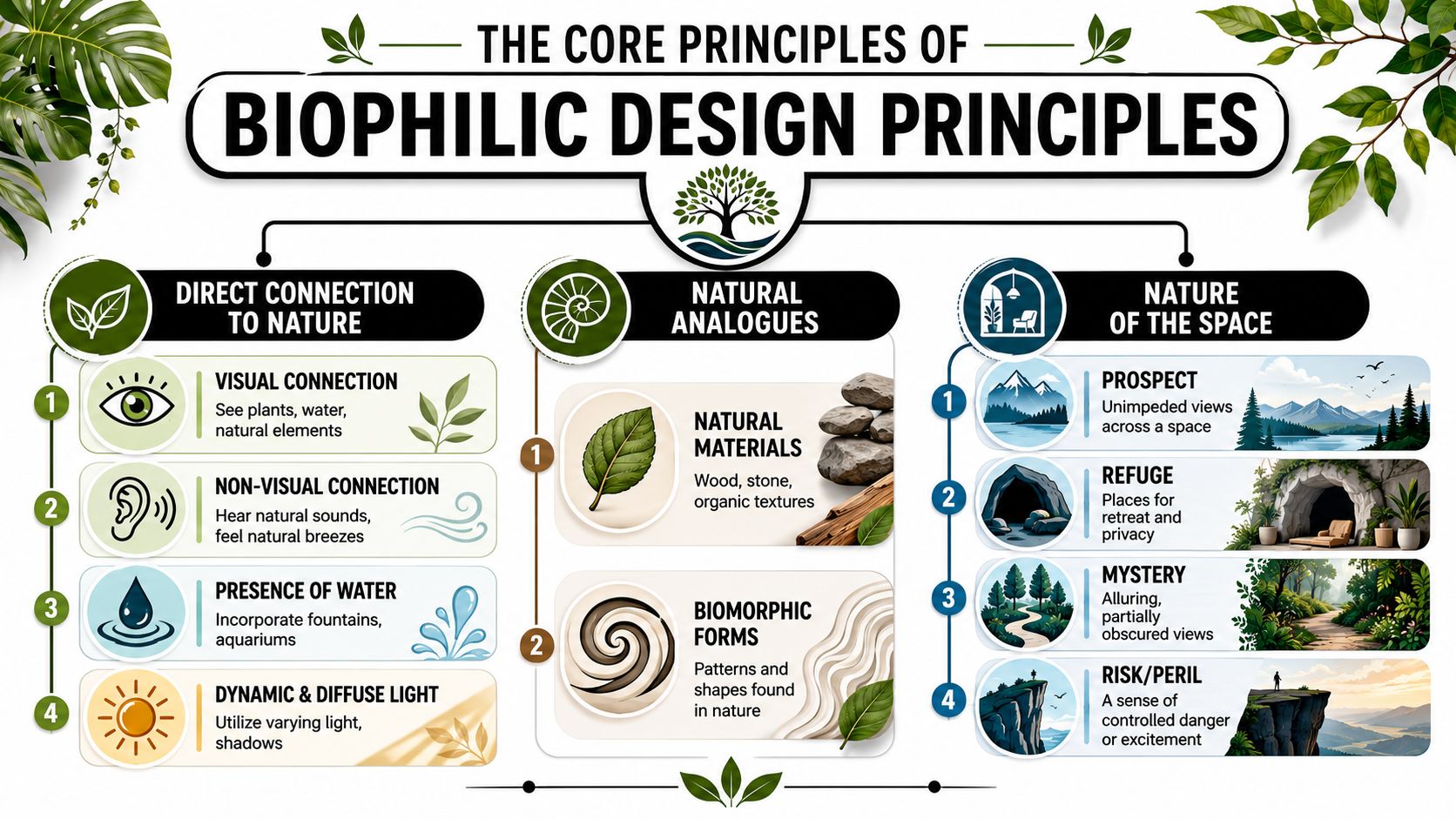
Nature in the space
This is often the first category recognized. It includes direct contact with natural elements such as plants, water, airflow, and light.
In office terms, this can mean seats with real access to daylight, not just a bright perimeter conference room no one uses most of the day. It can also mean hearing natural sound in a controlled way, feeling subtle air movement, or maintaining a visible connection to living elements instead of burying them in one amenity zone.
Natural analogues
This category covers references to nature rather than literal nature. Think wood grain, stone-like texture, biomorphic forms, and finishes that echo organic variation.
Biophilic principles enable many budget-conscious workplace projects to do a lot of heavy lifting. You don't need a greenhouse to make a floor feel less mechanical. A materials palette with visual warmth, tactile variation, and less plastic-looking uniformity often changes the experience of a space more than people expect.
A related concern is ergonomics. The physical environment works best when comfort, posture, movement, and sensory load are addressed together. That's why biophilic planning often pairs well with broader workplace ergonomics principles.
Nature of the space
This is the category many teams miss. It deals with how people instinctively respond to spatial conditions such as prospect, refuge, and a sense of discovery.
An office with prospect gives people clear views across a space. An office with refuge gives them places to work without feeling exposed. If every seat is equally open, the space may look contemporary but function poorly. If every seat is boxed in, the space becomes visually heavy and socially flat.
Practical rule: The strongest biophilic spaces don't maximize openness. They balance openness with shelter.
That balance is what separates a showroom concept from a workplace people can use all week.
Evidence-Based Benefits for Modern Workplaces
Most office teams don't need another vague promise about wellness. They need to know whether biophilic design changes how a space performs.
The honest answer is mixed. Public-facing evidence summaries often provide stronger support in healthcare settings than in offices. Office content tends to promise better wellbeing and productivity without saying which interventions matter most or what the tradeoffs are. That doesn't make the concept weak. It means workplace teams should evaluate it through practical outcomes such as concentration, comfort, attendance experience, and whether employees want to use the space.
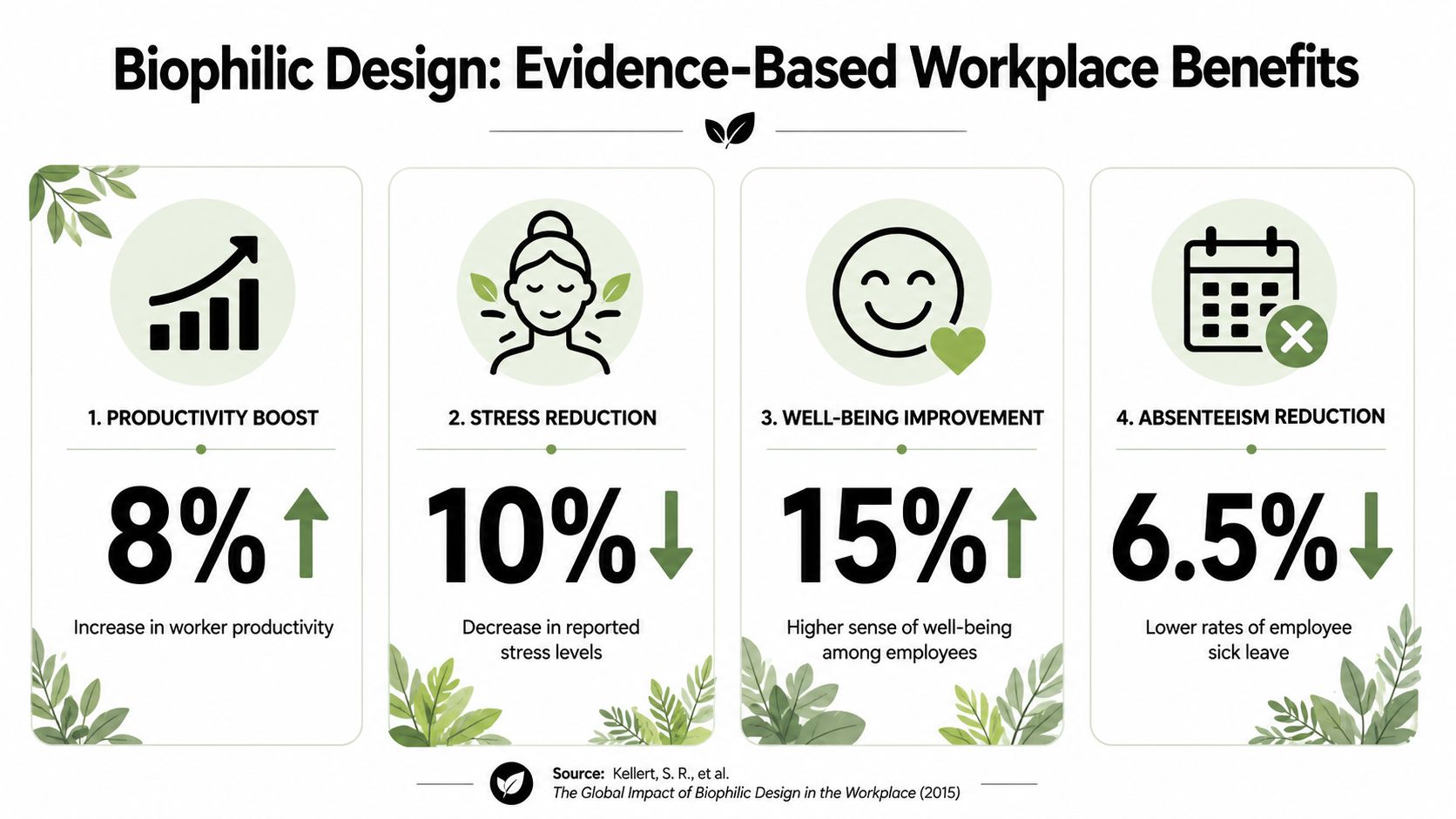
What tends to improve first
In real office environments, the first gains are usually qualitative, but they're not trivial.
- Visual comfort improves when daylight is shared better and harsh enclosed barriers are reduced.
- Focus improves when the layout gives people both social connection and protected work settings.
- The office feels more desirable when materials, views, and greenery make it less sterile.
- Everyday fatigue drops when the environment asks less of people mentally and physically.
Those aren't soft outcomes. They're operational. A workplace that feels draining by noon creates friction for every team using it.
Which moves usually outperform decorative add-ons
Some biophilic moves matter more than others.
Daylight access usually beats decorative planting alone. Spatial variety often matters more than a premium feature wall. Better material selection across everyday touchpoints often has more value than one expensive statement element in the lobby. That's why the strongest results usually come from coordinated changes rather than isolated gestures.
A lot of workplace performance also depends on whether people can use the space the way they need to. If the design supports focus, visibility, and informal reset moments, it tends to reinforce broader efforts aimed at improving workplace productivity.
Where teams get it wrong
The most common mistake is treating biophilic design like branding. A green wall gets installed, but the workstations still block windows. Wood-look finishes are added, but the floorplate remains monotonous and acoustically stressful. Plants are purchased, then slowly die because no one owns maintenance.
If the layout, light, and material decisions stay the same, greenery alone won't rescue the space.
Biophilic design works best when it changes the daily conditions people experience at their desk, in circulation paths, in meeting areas, and in quiet zones.
Putting Biophilic Principles into Practice in Your Office
A facilities manager usually sees the problem before anyone names it. The window line is blocked by tall panels, enclosed rooms darken the interior, and the one plant cluster sits in a corner nobody uses. The office has "nature" in it, but the day-to-day experience still feels closed, flat, and tiring.
The practical fix starts with the kit of parts you already control. Panel height. Room fronts. Finish selection. Storage placement. Shared zones. Planting that can survive standard maintenance routines.
That's why biophilic design works best as an office planning decision, not a decorating exercise.
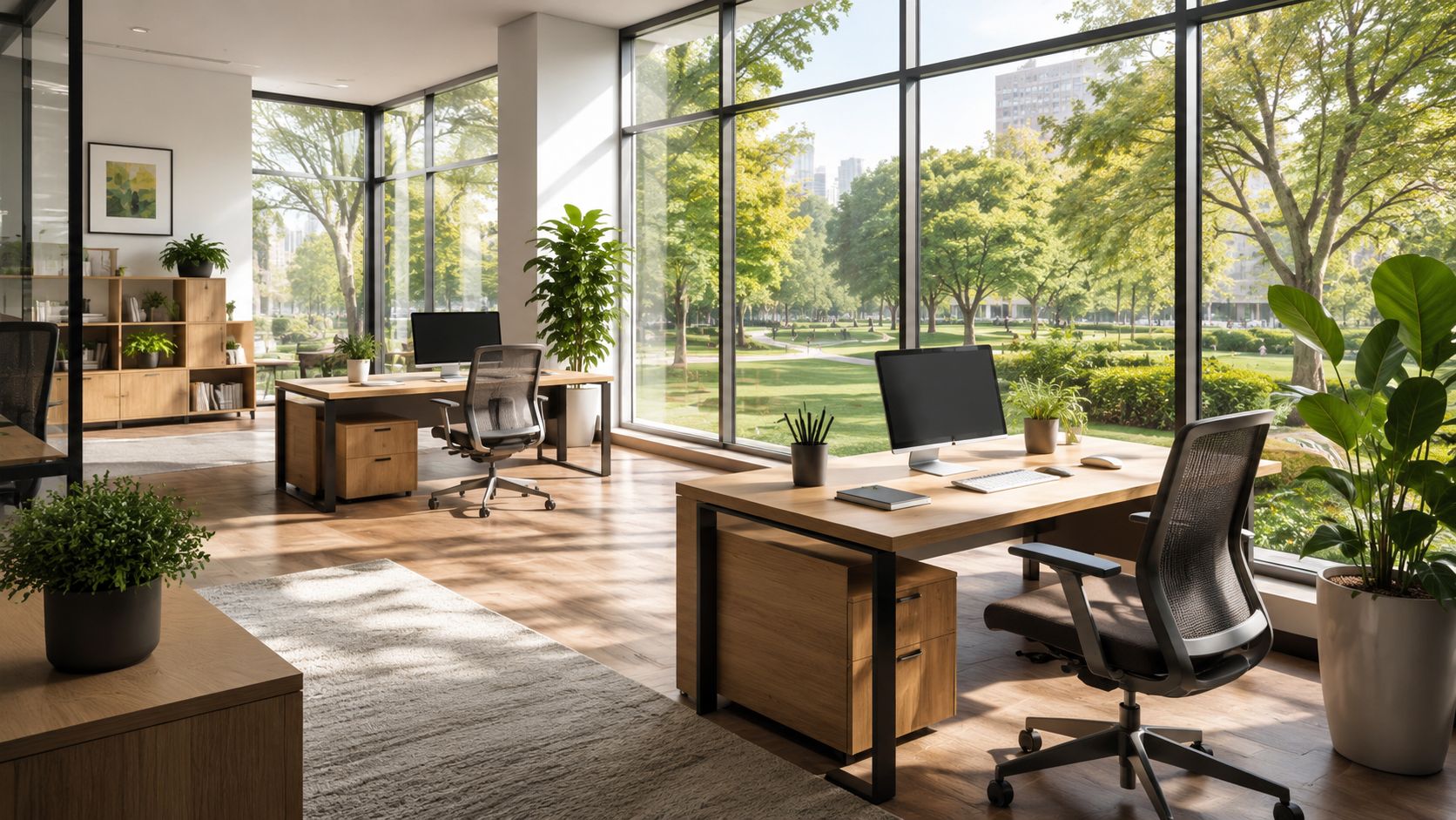
Start with the floorplan, not the accessories
Protect daylight first. If perimeter windows are your main natural asset, keep bulky storage, tall panels, and fully opaque room fronts away from that edge where possible.
In practice, that often means using lower workstation heights near the glass line, keeping circulation paths open, and choosing room enclosures that borrow light instead of trapping it. Glass-fronted offices and meeting rooms usually cost more than standard opaque construction, but they often improve the whole floorplate rather than one enclosed room. That trade-off matters on offices where only part of the team sits near windows.
A quick field check helps. Sit at desk height and look across two or three workstation runs. If your view stops every few feet, the plan is likely cutting off both light and orientation.
Specify natural finishes across repeat surfaces
Biophilic impact usually comes from what people see all day, not from one feature element near reception.
Use warmer, nature-referenced finishes on surfaces with constant visual exposure. Workstation panels, storage faces, worksurfaces, and shared cabinets usually do more for the overall feel of the office than a single accent wall because they appear across the full work setting. This is one reason modular systems are useful. You can spread natural texture through the floor without rebuilding the space.
There is a trade-off here too. Some natural materials add cost, maintenance, or code review complexity. In many projects, durable laminates and wood-look finishes are the better fit because they give the visual cue without creating avoidable upkeep.
Create open and sheltered settings on the same floor
People do better when the office offers more than one working condition. Some tasks need visibility and quick access to coworkers. Others need a seat that feels protected enough to focus.
Modular planning makes that easier to achieve without major construction.
- Open team areas: Lower panels and shared sightlines support fast coordination.
- Focus positions: Higher side screens, end-panel protection, or tucked-away seats reduce visual exposure.
- Call-heavy zones: Denser teams need stronger acoustic and visual control than general admin groups.
- Touchdown and reset areas: Lightly defined spaces near circulation give people a place to pause, land, or work briefly without claiming a full workstation.
This mix is where cubicles and glass walls can work together instead of fighting each other. Lower, more open systems can carry daylight deeper into the plan, while enclosed rooms handle meetings, calls, and confidential work.
Add plants where operations can support them
Plants help most when people encounter them and when someone is responsible for keeping them alive.
Put greenery in shared routes, meeting points, café areas, reception, and other high-visibility locations. Those zones give more people repeated exposure and make maintenance easier than scattering small plants across individual desks. For teams comparing species and care needs, this guide on selecting the best plants for offices is a useful reference.
Before adding live plants at scale, confirm four practical points. Who waters them. Which locations get reliable light. Whether planters interfere with cleaning or cable access. Whether dead or neglected plants will create a worse impression than no plants at all.
If you need a starting point, this practical guide to plants for office spaces can help match plant type and placement to real workplace conditions.
A short walkthrough of office planning choices can help make these moves more concrete:
Biophilic design with modular furniture
| Biophilic Principle | Office Application | Product Solution |
|---|---|---|
| Daylight and visibility | Open sightlines from perimeter windows into the core | Lower-height benching, glass-front rooms, transparent partitions |
| Natural material presence | Warmer surfaces across the visual field | Wood-look panel systems, textured laminates, natural-finish storage |
| Refuge and focus | Seats that feel protected without full enclosure | Higher side panels, pod-style work points, quiet corners |
| Green integration | Repeated contact with living elements | Planter-topped storage, shelf-integrated greenery, shared plant zones |
| Spatial variety | Different settings for different work modes | Mix of open stations, enclosed rooms, touchdown bars, phone spaces |
Your Phased Implementation Checklist
Most offices shouldn't try to do everything at once. Phasing works better because it lets you fix the biggest friction points first, then build toward deeper integration.
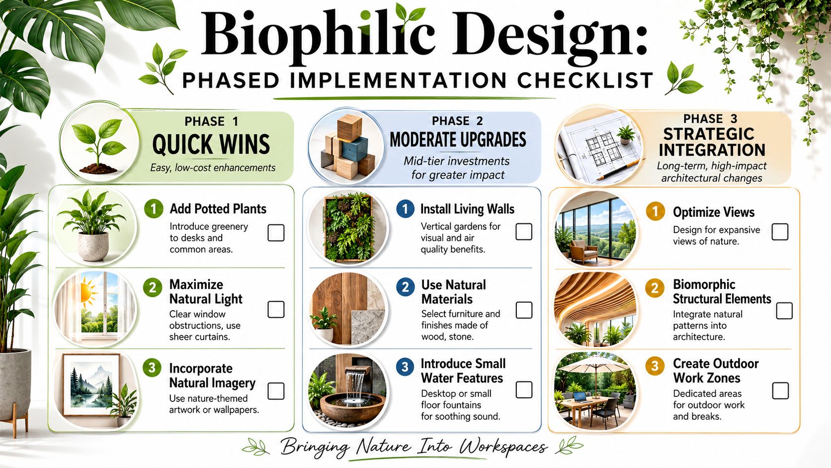
Phase one quick wins
Start with changes that don't require demolition, long lead times, or major approvals.
- Reposition workstations: Move the tallest visual barriers away from windows where possible.
- Declutter the glass line: Remove storage, signage, or furniture that blocks borrowed light.
- Use natural imagery carefully: Natural scene art can help in enclosed areas, but it shouldn't become a substitute for better planning.
- Create one visible plant zone: Start where maintenance is realistic, such as reception, café space, or a shared touchdown area.
These moves don't solve everything, but they make the office feel less sealed off.
Phase two strategic upgrades
Furniture specification begins to matter more than styling.
Choose systems that let you adjust panel heights, privacy levels, storage, and finishes by team function instead of applying one standard everywhere. A configurable custom cubicle designer is useful here because it lets you test openness, enclosure, and finish direction before purchase. Replacing opaque dividers with glass in selected locations is another high-impact move when you need separation without sacrificing light.
Decision filter: If an upgrade improves daily visibility, comfort, or flexibility for occupied work areas, it usually beats a decorative feature that only changes first impressions.
Phase three full integration
For a new office, major re-stack, or serious renovation, treat biophilic design as part of the planning brief rather than a finishing package.
That means aligning layout, lighting behavior, acoustic strategy, finish selection, circulation, and amenity zones around how people use the office. It also means deciding early where the space should feel open, where it should feel sheltered, and how shared natural cues will appear across the whole floor.
A full integration checklist usually includes:
- Window access planning
- Partition and sightline studies
- Material distribution targets
- Plant maintenance ownership
- Coordination with cleaning, power, and egress
The phased approach works because it keeps the concept grounded. You can start with a few visible improvements, learn what the building supports, and scale only where the office will benefit.
Understanding Costs ROI and Maintenance
The cost question is fair. Biophilic design can be oversold as if every office needs custom millwork, elaborate planting, and architectural changes. Most don't.
The smarter way to look at cost is to compare high-impact everyday improvements with high-visibility low-use features. Shared daylight, better partition choices, durable natural-looking finishes, and a more balanced workstation layout usually outperform one dramatic installation that creates maintenance headaches.
Where budget should go first
Spend first on the elements employees experience repeatedly.
That often means workstation reconfiguration, finish upgrades on large visible surfaces, selective glass, and lighting adjustments. If budget is limited, use laminates or technical surfaces that deliver warmth and variation without the price or upkeep of premium solid materials. When you're evaluating options, a realistic workspace price guide helps frame tradeoffs between initial spend and long-term utility.
Maintenance is part of the design
A biophilic office that isn't maintained becomes an argument against the concept.
Live plants need ownership. Natural or natural-look surfaces need cleaning protocols that preserve appearance. Water features, if used at all, need to justify their upkeep. Facilities teams should insist on low-drama solutions unless the organization is ready to maintain something more ambitious.
The best biophilic detail is often the one your team can keep looking good six months from now.
Think in operational terms
ROI in this context isn't just about a spreadsheet line tied to one product. It's about whether the office becomes easier to occupy, easier to like, and easier to use well. If a change improves visibility, comfort, flexibility, and employee perception at the same time, it has already moved beyond aesthetics.
That's why practical biophilic design usually wins through accumulation. Not one grand gesture. A series of sound decisions that make the workplace work better.
Frequently Asked Questions About Biophilic Office Design
Is biophilic design just adding plants to an office
Biophilic design works best as a space-planning strategy, not a decorating move. Plants help, but so do better sightlines, more daylight penetration, lower visual clutter, natural-looking finishes, and areas that give people a choice between focus and openness.
In office projects, the strongest results usually come from combining several modest changes instead of spending the whole budget on greenery.
Can you apply biophilic design in a window-poor office
Yes, but the goal shifts from maximizing direct nature access to reducing the hard, sealed-in feel of the space. Use glass selectively to borrow light across the floor plate, choose warmer and less reflective finishes, and place planting where it has the best chance of staying healthy.
A window-poor office will not feel like perimeter space. It can still feel calmer, brighter, and easier to work in.
Does biophilic design work in cubicle-based offices
It does, especially with modular systems.
The details matter. Panel height, fabric or laminate choice, shared storage placement, and the way aisles line up all affect whether people feel screened for focus or shut off from light and activity. In many cases, a cubicle-based office is easier to improve than a fully built-out one because reconfiguration costs less than construction.
Are natural materials always practical for commercial offices
Practicality depends on wear, cleaning, code requirements, and replacement cost. Solid wood, stone, and other raw materials can look excellent, but they are not always the right answer for high-traffic offices or fast-turn installations.
Good specifications often use commercial-grade surfaces that suggest warmth and texture without creating maintenance problems for the facilities team.
What usually fails in biophilic office projects
The weak points are predictable. A plant package with no maintenance owner declines fast. Tall opaque elements block borrowed light. Feature pieces get approved before the team fixes the daily experience at desks, meeting areas, and circulation paths.
That is why practical biophilic design starts with layout and material decisions people interact with every day.
Where should a facilities manager start
Start with a floor walk and a punch list.
Look for workstations with poor access to light, areas where employees feel overexposed, finishes that make the office feel flat or overly synthetic, and circulation routes with no visual relief. Then rank improvements by impact and difficulty. Reconfiguring panels, adding selective glass, upgrading visible finishes, and creating a simple planting plan usually produce more value than a full cosmetic refresh.
Do you need a full renovation to make progress
No. Many offices get meaningful improvement from phased changes that fit normal capital planning and installation schedules.
That approach is usually easier to approve, easier to maintain, and less disruptive to employees. It also lets facilities teams test what works before committing to a larger spend.
If you're planning a more functional, more human office, Cubicle By Design can help you turn broad workplace goals into practical furniture and layout decisions. The right mix of modular workstations, selective transparency, and finish updates can improve the feel of the office without forcing a full rebuild.