
Your office can feel half-empty on Monday, hard to get around on Wednesday, and strangely expensive every day in between. That mismatch usually isn't a people problem. It's a planning problem.
Space decisions are often still made the old way. They count employees, assign desks, and assume the floor plan is doing its job. In a hybrid office, that approach breaks down fast. Headcount doesn't tell you which neighborhoods are crowded, which meeting rooms are oversized, or why employees complain about lack of space even when empty desks are visible.
The fix is simpler than many managers expect. Start measuring the office the way people use it. Good office space planning metrics turn scattered observations into clear decisions about workstation counts, room mix, circulation, privacy, and cost.
Facilities teams don't need a giant analytics program to get value from this. They need a small set of reliable metrics, enough clean data to trust the patterns, and a practical way to convert those patterns into layout moves. If you're reevaluating footprint, planning a restack, or deciding between benching, modular stations, and enclosed rooms, metrics give you a better answer than gut feel ever will.
Office Space Planning Metrics Optimize Your Space
Introduction Why Your Gut Feeling About Office Space Is Wrong
If your office feels empty and overcrowded in the same week, your instincts aren't failing you. The office is sending mixed signals because hybrid attendance creates uneven demand across days, teams, and space types.
A lot of managers still plan around total staff count. That worked better when nearly everyone showed up on the same schedule and sat in assigned seats. It doesn't work when sales comes in together midweek, engineering rotates days, and conference rooms stay booked while private work areas sit idle.

The practical shift is to stop asking, "How many employees do we have?" and start asking, "How is this space performing?" That means measuring time-based use, seat fill, density, and real operating cost. Those numbers tell you whether you need fewer desks, smaller meeting rooms, more focus spaces, or a different mix of partitions and circulation.
For teams working through office space size planning, the biggest mistake is treating square footage as a fixed answer instead of a design variable. The same footprint can perform very differently depending on layout, furniture selection, acoustic separation, and how closely the plan matches attendance patterns.
Good planning starts when you stop designing for theoretical capacity and start designing for observed behavior.
That's why office space planning metrics matter. They don't just help you report on the workplace. They help you diagnose what's wrong with it and decide what to change.
The Core Four Office Planning Metrics Defined
Good planning decisions usually rest on four numbers: space per employee, utilization, occupancy, and density tied to cost. Together, they show whether the office is supporting work patterns or carrying excess space in the wrong places.
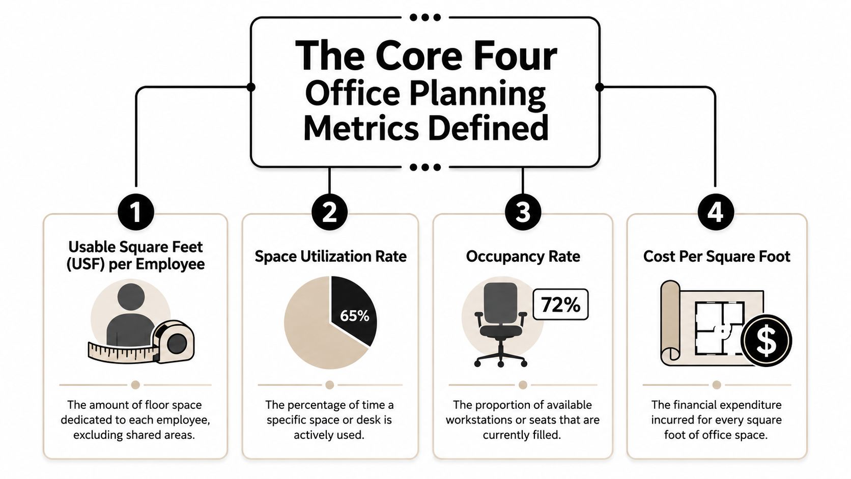
A facilities team can have acceptable lease costs and still field weekly complaints about noise, crowding, and room shortages. The usual reason is simple. They are measuring inventory, not performance. These four metrics help translate raw counts into layout moves such as reducing oversized offices, adding enclosed focus rooms, widening circulation, or shifting from fixed desks to modular workstations.
Usable square feet per employee
This metric answers the first sizing question. How much usable area does each employee have access to for work?
That number matters because gross square footage can hide poor allocation. I have seen floors that looked generous in the lease summary but felt tight in practice because too much area was locked up in oversized meeting rooms, long corridors, or private offices used a few hours a week.
Hybrid planning guidance points in the same direction. Open-plan workstation footprints often shrink, while shared enclosed spaces and bookable focus settings take a larger share of the plan, according to Anny's 2026 office space per employee guide. The lesson is not to chase a universal target. The lesson is to test whether your current allocation matches actual work modes.
That is where design choices start to matter. If usable square feet per employee is tight, benching more desks into the same footprint is rarely the best answer. A better answer may be smaller but better-supported workstations, shared touchdown areas, or glass-fronted rooms that preserve sightlines while adding acoustic separation.
Space utilization rate
Utilization measures use over time, not just at a single moment. The standard formula is (Actual Hours Used ÷ Total Available Hours) × 100, as defined in Matterport's office space planning metrics reference.
This is the metric I use to separate busy-looking space from productive space. A bank of desks may appear occupied during the lunch-hour walkthrough and still post weak weekly utilization. A four-person room may look insignificant on the floor plan and still run near full all week because it fits the way teams meet.
That distinction drives layout decisions. Low desk utilization may support hoteling or a smaller workstation footprint. High utilization in enclosed rooms may justify converting underused private offices into reservable focus rooms. If traffic clusters in a few neighborhoods, the issue may be adjacency rather than capacity.
A closer look at office space utilization trends and planning strategy usually shows the same pattern. The constraint is often uneven use across the floor, not total seat count.
Here's a short explainer before the next metric:
Occupancy rate
Occupancy measures how many seats are filled at a given time. The formula is (Occupied Seats ÷ Total Seats) × 100.
It is a practical operating metric. Front desk staffing, janitorial timing, pantry support, and day-of guest management often depend on occupancy patterns. It also helps planners identify peak-day crowding, which is where many hybrid offices break down.
Occupancy on its own is not enough. A floor can post moderate occupancy and still feel overloaded if people bunch near windows, team neighborhoods, or the few enclosed rooms with good acoustics. That is why occupancy should always be read alongside utilization and seat mix.
Use occupancy to measure pressure. Use utilization to measure efficiency. The combination tells you whether to add seats, redistribute them, or change the balance between open workpoints and enclosed settings.
Density and cost per square foot
Density shows how much usable area is assigned per seat. Cost per square foot shows what that decision costs to operate.
Density becomes useful only when it is tied to circulation, privacy, and workflow. Pack seats too tightly and the floor may look efficient on paper while underperforming in practice. Aisles narrow. Storage spills into walkways. Small meetings drift into open areas. Acoustic complaints go up. In many projects, a modest reduction in seat count plus better zoning produces a stronger result than trying to maximize every square foot.
Planning standards reinforce that point. Workplace guidance and code requirements in some markets set minimum space and movement-area expectations per workstation, and Anny's 2026 office space per employee guide summarizes several of those benchmarks. Those thresholds should be treated as starting constraints, not finished design solutions.
Cost per square foot keeps the conversation grounded. Rent matters, but so do utilities, cleaning, maintenance, security, and technology support. A lower-cost layout is not a better layout if it creates chronic underuse, frequent reconfiguration, or employee friction that pushes teams to work elsewhere.
A practical read on the core four looks like this:
| Metric | What it tells you | What it won't tell you alone |
|---|---|---|
| Usable square feet per employee | Whether overall space allocation is in the right range | Which settings are overloaded during peak days |
| Utilization rate | Whether desks and rooms are being used over time | How crowded the office feels at a specific moment |
| Occupancy rate | How full the office is right now | Whether the layout is efficient across the week |
| Density and cost | Whether the plan is spatially and financially sustainable | Whether the mix of space types fits employee behavior |
Advanced Metrics for a Hybrid World
Basic metrics tell you how the office performs. Advanced metrics tell you why employees still complain when the dashboard looks fine.
Hybrid offices expose the limits of averages. An average utilization number can look healthy while employee experience swings between easy, frustrating, and chaotic depending on the day. That's why planners need to look beyond the core four and start measuring peak behavior, room fit, and layout adaptability.
The employee risk threshold
One of the most useful concepts in current workplace analytics is the employee risk threshold. Employees begin experiencing space shortages and stress when average utilization reaches 70 to 80%, and organizations that plan for that threshold have seen a 40% reduction in overcrowding complaints, according to VergeSense thought leadership on workplace utilization metrics.
That finding matches what many facilities teams see in practice. People don't wait until a floor is mathematically full to feel friction. They react sooner. They notice when favorite neighborhoods disappear by midmorning, when circulation narrows, when quiet rooms are gone, and when meetings spill into open areas.
If you only plan for absolute capacity, you're already late. The better move is to define a safe operating zone and preserve buffer before the floor feels maxed out.
For organizations adapting policy and layout together, a strong hybrid work setup strategy usually starts with that threshold rather than with the lease line.
Peak-day resilience beats average efficiency
Peak days are where bad planning shows up. A floor can post acceptable average numbers and still fail badly on Wednesdays and Thursdays.
The more useful question is not "What is our weekly average?" It's "What happens on our busiest normal day?" In the verified planning guidance, average utilization may appear healthy while peak-day occupancy can exceed 95% or even 100%, and planning for hybrid variability often requires a 10 to 20% buffer capacity. The same guidance notes that acceptable forecast accuracy sits between 85 to 90%, while many organizations operate with 15 to 25% error margins.
Those figures matter because layout is physical. If your forecast misses by that much, the consequences show up in chairs, rooms, sightlines, noise, and wait times.
A few advanced measures are especially useful:
- Peak occupancy variance helps you compare normal days to busiest days so you don't overreact to averages.
- Meeting room fit shows whether room size matches actual attendance. A large room booked for a small group is a design problem, not just a scheduling problem.
- Forecast error margin tells you how much trust to place in your headcount assumptions before you build.
- Churn pressure reveals which teams or zones need furniture and partitions that can be reconfigured without major disruption.
What these metrics mean for layout choices
Data becomes design logic. If large conference rooms sit half-used while small enclosed rooms stay fully booked, the answer isn't more meeting space in general. It's a different room mix. If peak days create visual crowding before you hit full seat count, the answer may be better spacing, smaller neighborhoods, or more acoustic separation.
A hybrid office rarely needs more of everything. It needs a better match between attendance patterns and space types.
That often leads to practical design moves such as adding modular workstations that can be resized as teams shift, using glass partitions to create enclosed focus or meeting zones without making the floor feel closed off, and trimming oversized private offices in favor of bookable rooms.
The best advanced metrics do one thing well. They stop you from solving the wrong problem.
Measuring What Matters Data Collection Methods
A floor can feel full at 10:30 a.m. and still be underused by the end of the week. I see that mismatch often. Teams react to one crowded Tuesday, then make expensive layout decisions without knowing whether the pressure came from arrivals, meeting room bottlenecks, or a circulation problem near shared amenities.
Metrics only help when the collection method matches the decision. If the question is daily attendance, badge data may be enough. If the question is whether six-person rooms are really hosting six people, you need a closer read.
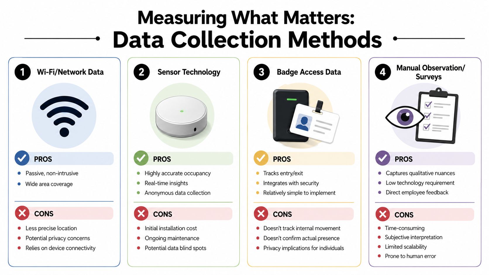
Comparing the main options
| Method | Best use | Main limitation |
|---|---|---|
| Wi-Fi or network data | Broad trend visibility across large spaces | Less precise at seat or room level |
| Sensor technology | Real-time occupancy insight for desks and rooms | Requires hardware investment and upkeep |
| Badge access data | Entry and exit patterns by day | Doesn't show internal movement well |
| Manual observation and surveys | Qualitative nuance and behavior context | Time-consuming and harder to scale |
Badge data is often the cleanest starting point because many organizations already have it. In some buildings, systems tied to secure smartphone building entry also improve the access record while making arrival easier for employees. That is useful when the first planning decision is how many people show up by day, not which exact seat they choose.
Sensors earn their cost when layout changes carry real financial consequences. They help answer specific design questions: Are focus rooms occupied or just booked? Are touchdown desks turning over during the day? Are quiet zones being used as intended, or avoided because of glare, traffic, or noise? Those answers directly affect room mix, workstation counts, and whether glass partitions or acoustic dividers will solve the actual problem.
How long to measure
Short sampling periods create bad layouts. A leadership offsite, quarter-end push, recruiting event, or holiday week can distort occupancy enough to point the plan in the wrong direction.
A longer collection window gives planners a fair picture of normal behavior, recurring peak days, and low-use areas that stay low-use for a reason. As noted earlier, collecting several consecutive weeks of attendance and utilization data is a much safer basis for decisions than relying on a few snapshots.
The goal is not more data for its own sake. The goal is enough evidence to tell the difference between a temporary spike and a pattern that should change the floor plan.
Choosing a method that fits the decision
Start with the decision, then choose the method.
- Use access data to verify attendance patterns by day and by team.
- Use room booking plus spot checks to fix mismatched meeting room sizes.
- Use sensors when you need confidence before changing seat ratios, enclosed space counts, or high-cost furniture layouts.
- Use observations and surveys when complaints point to friction that occupancy dashboards cannot explain, such as poor sightlines, noise bleed, or congestion at shared resources.
A good office space planning software platform helps combine these inputs into one working view, but the software is not the hard part. Clear collection rules, consistent time windows, and honest interpretation are what turn raw metrics into layout decisions you can defend.
Applying Metrics A Step-by-Step Framework
The most common failure in office planning isn't bad math. It's stopping at the math. Managers gather metrics, confirm a few suspicions, and still don't know what to move, remove, shrink, or add.
A workable planning framework turns office space planning metrics into layout choices that can be implemented.
Step 1 Benchmark the current floor
Start with your current seat count, room inventory, usable area, attendance pattern, and known friction points. Pull the facts together in one place and make the floor tell the truth.
If employees say the office feels crowded, identify where that happens. It may be the workstation neighborhoods. It may be the enclosed rooms. It may be circulation through one pinch point near lockers or café space.
Step 2 Set targets that reflect behavior
Targets should fit how people work, not how the lease abstract reads. If your issue is peak-day frustration, set goals around resilience and fit rather than maximum theoretical efficiency.
This planning table helps frame the shift:
| Metric | Traditional Office | Hybrid-Optimized Office |
|---|---|---|
| Open-plan workstation space | 75 to 100 sq ft per person | 50 to 75 sq ft per person |
| Shared or bookable private offices | 150 to 250 sq ft | 100 to 150 sq ft |
| Focus pods | Less common in older plans | 25 to 40 sq ft |
| Meeting room mix | Larger rooms emphasized | More small rooms and pods |
Those hybrid-optimized projections come from the earlier Upflex guidance and are useful because they connect attendance behavior to room and seat sizing, not just to total headcount.
Step 3 Model a realistic workstation count
A practical example makes this easier. If 60% of a 200-employee workforce attends on the busiest day, the right planning target is 120 workstations plus a 10 to 15% buffer, which results in roughly 135 to 140 workstations, according to Gable's workstation planning example.
That calculation is more useful than assigning 200 desks because it reflects attendance reality and preserves flexibility for visitors and growth.
Build for normal peak demand plus buffer. Don't build for payroll count unless your attendance data proves you need to.
This is usually the point where furniture strategy becomes critical. A fixed plan with oversized stations can trap too much area in assigned seating. A modular plan can hold the workstation target while preserving room to add focus rooms, touchdown areas, or smaller enclosed spaces.
Step 4 Test layout scenarios before you buy
Once the numbers are clear, model at least two or three versions of the floor. One may emphasize higher bench density. Another may shift square footage into enclosed rooms. A third may break a large open area into smaller neighborhoods using partitions.
A digital planning tool like the office layout planning guide and resources can help teams compare circulation, storage, privacy, and future reconfiguration before procurement starts.
Useful scenario questions include:
- What happens on the busiest normal day if every planned desk is occupied at the target buffer?
- Which rooms are likely to fail first under the current booking pattern?
- Can partitions create privacy without blocking daylight or making supervision difficult?
- Will a team with higher churn need modular stations rather than fixed millwork?
- Are any spaces oversized for their actual use, especially private offices and large conference rooms?
Step 5 Pilot, measure, adjust
Start with one zone if the organization is cautious. Pilot a new workstation standard, a revised room mix, or a neighborhood with more acoustic separation and fewer oversized desks.
This is often where product type matters. Teams with repetitive, high-volume activity may need tighter but carefully planned call center layouts, while project teams may benefit from more adaptable custom stations and enclosed focus rooms. Glass partitions are especially useful when you need separation, visibility, and daylight at the same time.
Measure the result the same way you measured the problem. If complaints shift from crowding to lack of privacy, the pilot revealed a real trade-off before a full rollout. That's a win.
Conclusion Your Data-Driven Workplace Blueprint
A workplace plan earns its keep when the numbers lead to a better floor, not a thicker report.
The goal is to turn occupancy, room demand, circulation pressure, and seat sharing into specific layout decisions. That may mean cutting desks that sit empty most of the week and adding enclosed focus rooms where demand consistently exceeds supply. It may mean keeping the same headcount but redistributing space so busy neighborhoods get wider aisles, better acoustic separation, and a room mix that matches actual work patterns. In many offices, it also means choosing modular workstations over fixed layouts so the plan can adjust without another full rebuild.
Good planning also requires judgment. A tighter plan can lower cost per person, but it can also raise noise, queueing, and frustration on peak days if circulation and privacy are ignored. A generous plan can feel comfortable, but it often hides underused private offices, oversized conference rooms, and storage that no longer serves the team. The right answer is rarely maximum density or maximum space. It is a layout that fits how the office is used.
That is the blueprint. Measure objectively, identify the pressure points, and translate each metric into a physical change people can feel.
If your office still runs on assumptions, start there.
When you're ready to turn planning data into a physical workplace, Cubicle By Design can help with Cubicle Designer, custom office cubicles, glass office partitions, call center cubicles, and workstation cubicles that support flexible, efficient layouts.